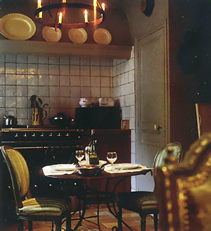
Black is very interesting in kitchens...sometimes you hardly know it's there. It is a neutral and it makes a statement, but sometimes it comes on like the strong, yet silent type of statement, sort of like Leonardo DiCaprio...don't you just wonder what's going on behind those eyes (and those eyebrows?) I know I do. Moving on...
Many of us are familiar with a classic light to medium blue gray color, found more in Swedish kitchens than in Danish kitchens, for example. Why gray? Isn't the air cold enough to be also reminded with a cool color? I wonder about that. Doing some quick research does not reveal answers. I'll need to get on this trail.
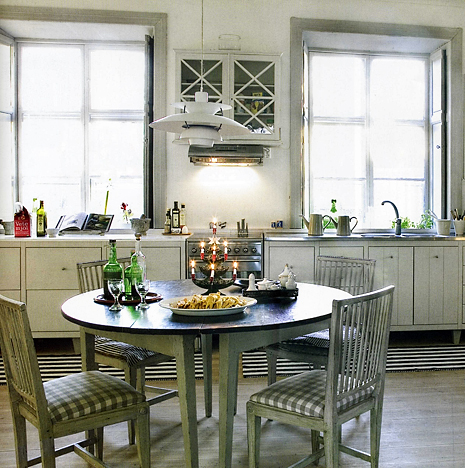
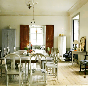
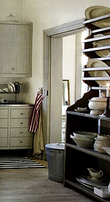
The light gray kitchen and dining area is from Vakre Hjem & Interior. The white kitchen, from Interior Magasinet, as well as the top image. The rustic wood and white kitchen, from Bo Bedre.
Enjoy!
 |  |
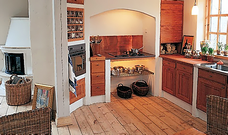
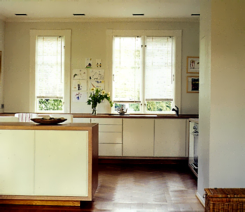 The top light gray kitchen, is very subtly eclectic in style. Notice the lighting fixture above the table. While a classic design, by Poulsen, and designed many decades ago, it is a contemporary feel. The cabinetry, to me, seems a beautifully simplistic country style, yet, with modern overtones, which complement the lighting fixture. The expanse of wall in a singular color, with little ornamentation can also be interpreted in a simplistic modern way as well as simple country. I suppose in the end, we seem to be looking at a modern country look. Do you agree?
Oh, before I go, again, here are some wonderful Scandinavian blogs...I hope the authors will comment on what they see makes their kitchens so special! Take a look at Dreamhouse, a white kitchen in the latest post, and Annas hus pa landet, with a list of blogs to make you procrastinate all afternoon! OK, and one more, Sara vill fara.

