Kitchen Design Chronicles - Gray's Anatomy

My kitchen renovation is in full swing and what a journey it's been up to this point - one that I will be sharing in the weeks and months ahead and there is so much to share! I'm fortunate to have a partner in the development of my kitchen renovation and that partner is Cabico Custom Cabinetry, which is sponsoring my kitchen cabinetry. 

The kitchen is that place where all five senses reside which manifests itself in your thoughts and feelings as the kitchen is used in so many different ways. It's a place that is more than just a design - it's an emotional environment in so many ways, don't you think? 

When you're a design professional as I have been for 25 years, you are your own client, and you have catalogs, resources, design ideas and your personal lifestyle needs all swimming in your head AND you're designing the kitchen for your forever home, that's pressure!!

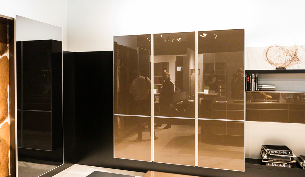
I know the Cabico brand from the beginning of my career as a certified kitchen designer. At that time, and still today, Canadian cabinetry was known in the industry for its innovation in design and very much so for precision engineering. In fact, Canadian cabinetry was thought to be on par with European cabinetry's cutting edge manufacturing - or maybe it was vice versa, European manufacturing being on par with Canadian! The point is, I have known and respected Cabico Custom Cabinetry for many, many years and am thrilled to be installing a Cabico kitchen in my home soon. More about Cabico in another post.

Let's talk color!

I'm going about this a little backwards, but rather than show you today the colors that I considered, any of which I'd be happy to use and which I will soon show you, I want to show you the color I finally chose (after much back and forth). I want you to see it in context with other shades of whites and grays.

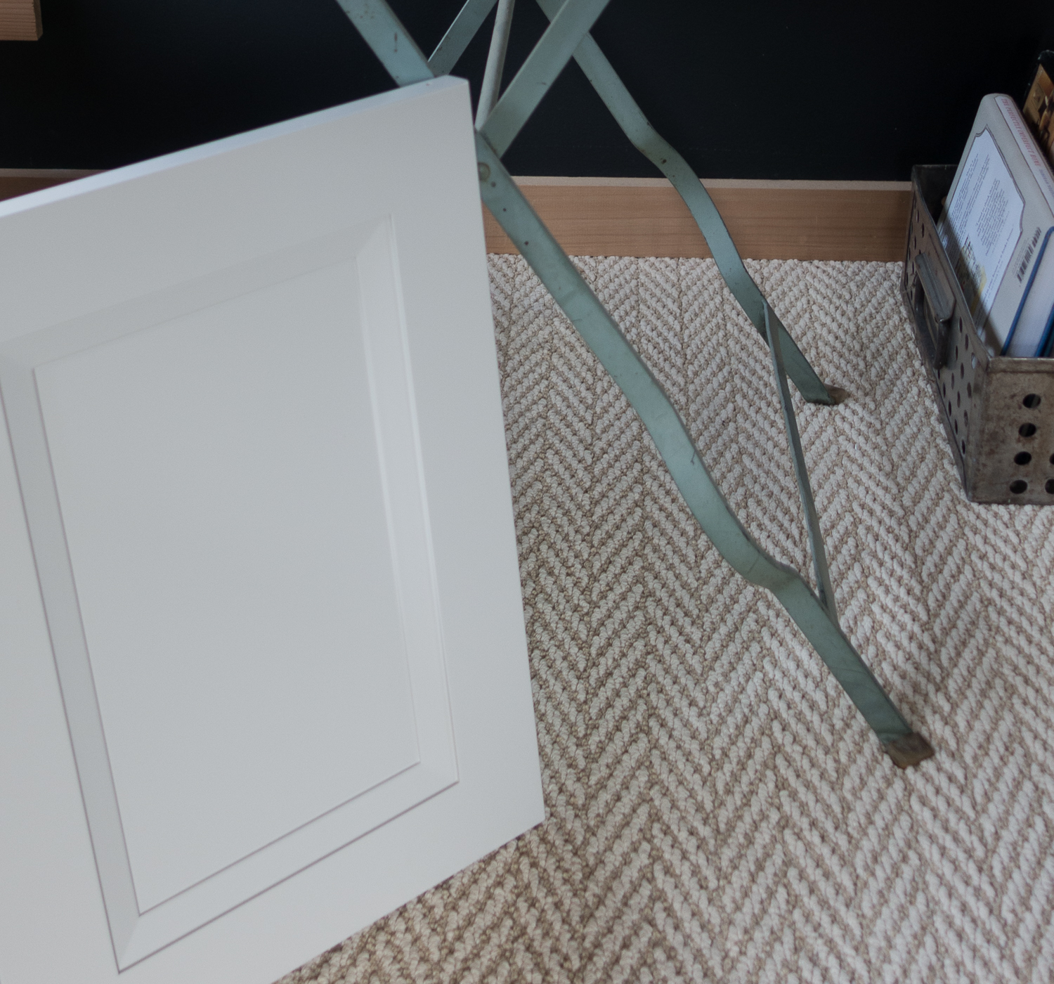
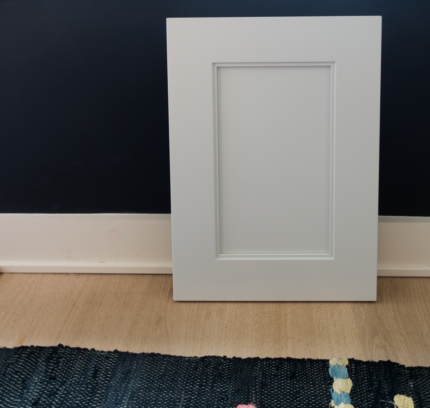
The color is Nantucket Gray. BUT, it's not just any gray. And this is not a gray to think of as a trend color. In fact, it barely looks gray! It's a highly nuanced, extremely flexible color that I know will stand the test of time. It's a bit warm, a bit white, a bit gray and a very elegant color.

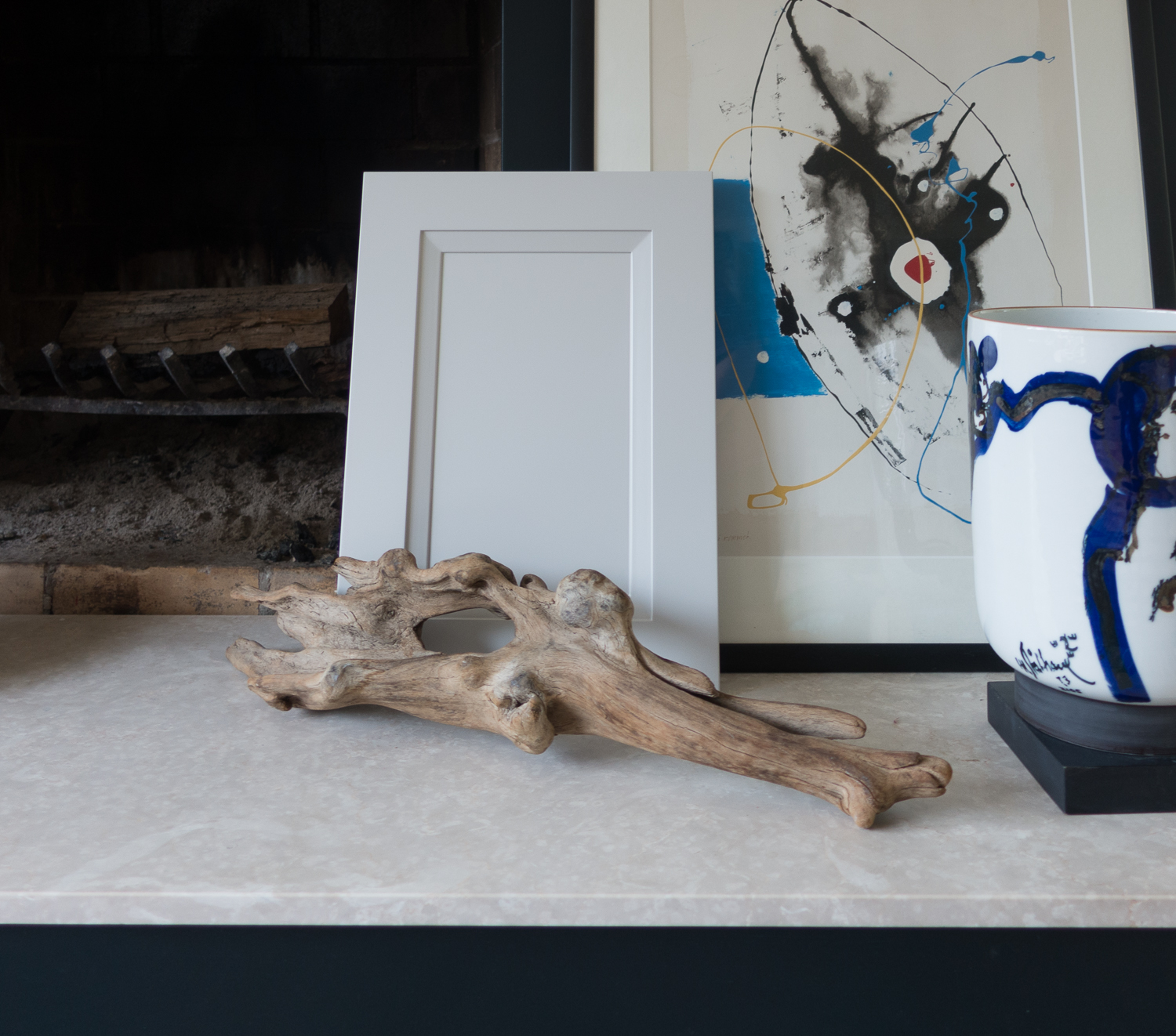
All throughout this post are images of this Nantucket Gray door (my door will be a flat/slab door). Look at the door next to other colors and materials.

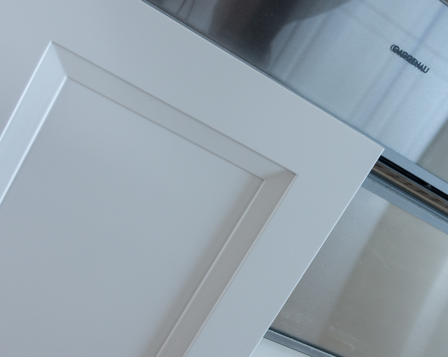
In some images, the door looks white, and it could look white-ish if you wanted it to. In my kitchen, which I'll later explain, I don't expect it to look white, or gray. I expect it to react to natural and unnatural lighting; be influenced by surrounding color and design elements for a look that changes, really, by the hour.

I also expect this color to be affected by the parade of Scandinavian Made rugs that I intend to use in the kitchen and change as the mood strikes. I love change and I look forward to seeing how Nantucket Gray changes in color and spirit with all these design and natural design elements working together. That's the thing to think about when designing a kitchen - you want to have a global vision of how light and design work together. This color, I know, will delight for many reasons. In truth of course, any color and finish is affected by light. But, it's good to keep that top of mind from the start.

And so begins the story of my kitchen renovation, and trust me, there are stories!! I want to hear your stories about how your kitchen changes with light and how you experience it AND how the color of your cabinetry reacts. Wait till you see the other colors I considered! I could have been blindfolded and picked any of them and be thrilled!

Thos. Moser and The Cumberland Collection - Maine Meets Scandinavia

I visited rural Maine last fall, at the invitation of the folks at Thos. Moser to experience the entirety of the Thos. Moser brand, from design to the crafting process in the factory to viewing the pieces in their beautiful showroom. The new Cumberland collection brings this experience full circle to me.

During the year following that visit, every time I thought of the experience of those few days spent in Maine, which was week after week, I was overwhelmed. I was overwhelmed by the people, the processes and the incredible detail of their work along with their dedication and the brand philosophy. I took 636 images. I couldn’t stop taking pictures of my experiences while there.

Image by Thomas Moser

But, one thing that I didn’t expect to feel was a sort of emotional crossroads, an unexpected intersection between my personal Scandinavian heritage and my American roots. The two parts of me collided in a very surprising yet natural way as I became intimately acquainted with the Thos. Moser furniture.  

Those of you who know me know that I identify very strongly with Scandinavian design. It’s a design aesthetic that I grew up with and which, in later years, feel comfortable with in all its many iterations. Yet, I’m first a proud American and I am equally comfortable with and enjoy good American design.

Image by Thomas Moser The Thos. Moser brand, to my eye as well as to my heart and soul, features a stunningly original representation of a mid century design aesthetic with a wholly American point of view - for me, and I know, for many others - the best of both worlds. It’s uniquely American and American design at its best in terms of craftsmanship, simplicity as art and function and allowing the lines to speak for themselves in the most organic way. 

Image by Thomas Moser

I thought of Thos. Moser when I went to Denmark this past summer. Seeking out the furniture stores which sell authentic midcentury Danish furniture, it is always wonderful to see these historic pieces in their original finishes and materials. I thought how much English and French furniture styles saturate the American market. I thought how Thos. Moser focuses instead on design restraint - pure form and function - with the “less is more” philosophy of the Scandinavians. 

Image by Thomas Moser

That is the most difficult design objective of all - the use of restraint rather than the addition of ornamentation and detail to fill in perceived gaps. There are few American furniture manufacturers whose design directors appreciate the importance of design restraint, the beauty that comes from this philosophy and how pure function translates into beauty.

And NOW, again, fresh from my trip to Denmark, Thos. Moser has introduced a new collection, Cumberland, designed by Adam Rogers, Director of Design, inspired by Danish design. It is simply breathtaking. It is fresh and original. It is art and emotion. The finger joint detail in this furniture collection exemplifies the Scandinavian design aesthetic as function is on equal footing with form. Traditional materials, expert craftsmanship and modern design merge as the foundation of Cumberland in an exciting, new, way.

Image by Thomas Moser

Given the introduction of this wonderful new collection, I wanted to bring together my deep feelings about how Thos. Moser furniture touches me personally and also present the new Cumberland collection at the same time in this post. More images and insights soon from my time in Maine at Thos. Moser! 

Customize Your Countertops With Concrete

My colleague, Laurie Laizure, founder of the Google+ Community: Interior Design Community sees products, talks to manufacturers, designers and others in the design community every day and one of those products is concrete, which we see used in so many different ways in home design. Laurie has shared with me that she has a "thing" for concrete, and here are her thoughts on this interesting material. Thanks for your insights on concrete, Laurie!

In Laurie's words ...

I have a confession. Born and raised in New Hampshire (also known as “The Granite State”), it feels a little wrong admitting this, but I am not a fan of granite countertops and never have been. Even though there are many colors and patterns available in granite, the look is often a bit busy. I’ve recently been researching concrete countertops on Concrete Network, which has loads of amazing design ideas, and everything you need to know about concrete countertops.

Following the trends in Europe for some years now, engineered stone, tempered glass and concrete have been making their mark. With the popularity of granite beginning in the early 1990’s, it’s no wonder that homeowners are now interested in finding something new. When you consider durability and affordability, concrete is a real winner.

What about color? Many people think of concrete as a dingy gray material with a rough texture that would not be appealing to prepare an evening meal on. This is not what concrete can be today. There are thousands of color options created by mixing different pigments, stains and aggregate colors to make your countertop completely customized and unique to you.

Let’s take a look at some interesting concrete countertops to give you some ideas during your next kitchen remodel.

Customized shapes and features

Image Credit: Concrete Network, Design by Pourfolio Custom Concrete, San Diego, CAI love the space for soap and the architectural interest of this circular basin. These counters are sure to be a topic of conversation when entertaining.

Get the look of natural stone:

Image credit: Concrete Network. Design by Absolute ConcreteWorks in Poulsbo, WA

Concrete can replicate many stone products at a much more wallet-friendly price-point — and it’s easier to repair if damage occurs.  Want to show off your artistic side? The countertop above is unusual and has the feel of gorgeous natural stone. You might be surprised to know that this option also passes LEED certification and features a terrazzo finish with an inlaid Brazilian agate and acid-stained borders. Anyone can appreciate this stylish look!

Image Credit: concrete-countertops.orgDo you prefer a more traditional look?

Even though concrete may be considered a new and modern material for countertops, styles can be created for any taste profile. This is a more traditional style mold and the results on this island are simply stunning. I love the way the creamy ivory base contrasts with the warm beige that almost has a hint of copper that you see then repeated in the cabinets.

Why stop at a countertop?

Image credit: Concrete Network Design by: Eycon in Myersville MD

Creating a unique backsplash by adding embedded objects adds texture and style.  Perhaps you have precious mementos you would like to incorporate? I think children’s handprints would be a sweet reminder of afternoons baking with your little ones. If you are thinking of something more refined, perhaps a marble carving from a family vacation to the islands or even a few stones you picked up on a special trip through Europe? The options are really endless. Embedding these items into concrete is easy and can make your kitchen much more personal which is not an option you usually have.

Consider concrete, a new and cutting-edge material to use as a design option in your next remodel. It is an economical, sustainable, and easily repairable option with endless customizable finishes. Would you consider concrete countertops? I would love to hear your thoughts in the comments!

Laurie Laizure is the founder of the largest online community for design pros, Interior Design Community. Laurie’s work has been featured on various cable networks such as Bravo and HGTV as well as top publications in the interior design world such as Country Living magazine. 


Miele Appliances - It's Really All About The Food

Last fall I attended a press event in Seattle with representatives from Miele, in part, to be up close and personal with Miele appliances via an extended and relaxed cooking session, the focus of the 2 day event.

What I didn't expect was that the entirety of the event would be one soulful experience after another which blew my mind, and I'm very serious, so this post may be a little emotional, expressive, and whatever else comes out into text.

I'm here to tell you that Miele, that precision engineered, sleek, elegant, highly designed, upscale brand, has a whole lot of soul not so far underneath its sleek and buttoned up exterior.

And, that's nice to see.

FYI-do not miss the slideshow of my images below!

As mentioned, the centerpiece of the event in Seattle was to cook with Miele appliances, particularly with their new Combisteam oven, a very versatile appliance that cooks foods to their optimum level of taste. Of course, taste is subjective, but Miele has the foundation built into the Combisteam oven to allow you to follow their lead or to use the oven controls as a take off point toward your own adventurous cooking path. Cooking with moist and dry heat in different combinations, to me, provides nothing less than a creative cooking experience - a little bit of soul purposely built in, I'd say.

There will be another post on the lengthy cooking session that we had at the Miele Seattle Center, but first, a little about the activities before we began cooking.

The first evening was a wonderful dinner at Altura, Seattle's famed open kitchen restaurant. So, right from the start of the event, the cooking process was there for us to witness in all its chaos, tastes, textures, creativity and always, the extremes of the cooks - uber patience mixed with that crazy/breakneck speed/pressure cooker factor which is so entertaining!

The next day started with a tour with a guide who was the essence of cool, hippie, hipster and comedian all rolled into one. The vibe was perfect - the tour was relaxed and focused around Seattle's Public Market, which, if you have not been to it before, it is an indoor farmer's market times a million.

We stopped at quite a few small markets, sampling teas, meats, baked goods and moremoremore. We had mini lessons with purveyors of the shops in how and where their food items are grown, insight on sustainable growing methods and small batch distribution of their food products.

We walked through the entirety of the market. Here's the thing - for these several hours of the tour (it was a long tour) we were happily assaulted with wonderful visual stimulation, often based on plain and simple values where many shops' handwritten signs told a story of what items were in season, just arrived, unique, on sale or another such message. It gave me a feeling that there was no compromise or substitute for the honest, hard working and passionate commitments of the shop owners.

Other visual stimulation was clutter, but an organized clutter (sometimes) and lots of it! An abundance of colors, textures, sounds, tastes and well, this place not only touched all of the senses, but attacked them in the most pleasurable way!

So, we shopped for our food we were to cook later, we quickly got to know one another in this invigorating atmosphere, and I, for one, could not help being "all in" as I took one step after another on this tour. After the tour, there was even time for us to go out on our own before we were to head to the Miele Center.

Note: Please click on the full screen icon - the difference in the slideshow from small to large is incredible!!

Miele put an enormous importance on this part of the event. The proof is in the pudding - we spent more time outside of Miele's showroom throughout the entire event than we did in it, quite a bit more. That surprised me, which speaks to a stunning commitment by Miele to the global experience of the process of food preparation.

Next post will be on the cooking session at the Miele Center. Can you visualize it? After this very soulful day, going on to work with these beautiful ingredients, socializing, and creating delicious foods was multi dimensional - soul, creativity and science colliding in a big way!


Tile Trends 2014

Having just returned as a guest of Tile of Spain, after attending Cevisama, held in Valencia, Spain, one of the largest tile industry shows, I have compiled a list of tile trends you will want to know about NOW. Just a note - have you seen Tile of Spain's website? It's GOOD - filled with information, quick ship products and easy and fast to navigate. Worth a mention and a visit.

Based on studying my images (over 3,000), here are the tile trends that I spotted on the show floor. Many are continuing strong trends from previous years. Other peripheral trends, at an early stage, are venturing into new visual and functional territory. The trends I spotted are in no particular order. I will do three posts with five trends each. See below for examples of the first five trends!
Fresh Traditionals
New Elegance
Retro Rules
I took this image at the end of my time at Cevisama. It captured the essence of the show for me - tile as a natural, emotional, and yes, warm, element
Urban Craft
Home Craft
....................
Metallics
Rustic Wood
Nordic Light Flooring
Multi Stone Mashup
Disruptive Innovation
....................
Dimension Defined
Photo Stories
Tile as Paper, Fabric, Mirror
Large Format in Situ-How To Use
Concrete Zen and Grays
Fresh Traditionals - A fresh take on traditional motifs and design which we have seen taking hold around the world in all products for residential design and new traditional tile interpretation is cool, beautiful, fun! AND, it's perfect for today's easy living.
New Elegance - It's bigger, bolder and dares to emulate traditional elements such as raised panels, strong new flooring patterns and smart sophisticated designs. Mid Century Modern interpretation is seen in new tile shapes, sizes, colors and quiet finishes.
Retro Rules - Exciting to me, are we seeing a return to terracotta colors but with new textures - it's coming! The deep, rich colors and organic textures of the 70s to 90s are coming back along with companion motifs that feel familiar yet new. This trend category was among my favorites that I spotted at the show.
Urban Craft - Anything goes, from comic book motifs to artistic expression that is unique and replicates materials such as rough metals, mirror and has the use of text on occasion. Absolutely exciting!
Home Craft - The look of hand painted motifs that are simple and always charming. Home Craft tile trends also are made with textures that have a warm, handmade look to them - sometimes in pastels or conversely in bold, classic yet primitive patterns.


Without further ado, take a look at the first five trends I spotted at Cevisama! For an overview of my trip to Spain, sponsored by Tile of Spain, see a little bit of my visit to Spain


Tile of Spain - Tradition and Innovation Defined

Last Week I was a guest of Tile of Spain on a trip that immersed our small group in Spanish history, culture, and tile innovation as we attended the fantastic tile fair, Cevisama, an image of the fair below.

To experience Spain in this 360 degree way allowed me to connect the dots from historic art and tile to modern, quite incredible architecture, to innovative food still grounded in tradition, to stunning, modern tile design and impressive technological advances in tile, all of which has shown me that there is a great energy and spirit for design across many disciplines. The desire and commitment for excellence has always been a source of pride, justifiably, for this beautiful country.

Aparici Showroom

I took just about 3,300 images of Spain in all its glory. We toured both Madrid and Valencia, led by at least three architects who lived in the region. I think, quite simply, that Spain's commitment to and achievements, today, in design and design innovation may well be under the radar of many who appreciate good and intelligent design.

What I have seen in this, my fourth visit to Spain in four years, was more of the same - truly stunning design and architecture, which includes the Spanish tile industry. There is no question in my mind that Spain is a leader in tile design and development. I've seen endless installations of Spanish tile in showrooms and at Cevisama, have spoken to owners and employees of factories and have walked the factory floors. Noteworthy form and function is everywhere.

It's more than a cottage industry in Spain - it's a sophisticated strategy to produce tile for the world that is beautiful, useful, of good quality and sustainable. It is fairly recent that Tile of Spain has begun their campaign to create awareness of their natural strength in tile design and manufacture, and from my firsthand look, it is exciting to see so many people passionately dedicated to producing smartly designed tile products. Below is a bridge overpass designed for a modern mosaic mural.

As this is more of an overview post, I will aim, via these images, to communicate a feeling of awe inspiring design and architecture which includes the new, the old, and sometimes mixing both to create a modern experience.

To talk trends (next post) you really need to see Spain from this vantage point, so I hope you can see that you are in for a treat!

Mr. Steam Steam Bath - For Health & Wellness

Mr. Steam's steam generating products for the shower, unbeknownst to me until last month, have powerful, and seemingly magical qualities that can actually add a positive dimension to your life. Sounds like ad-speak, right?

I'm a typical stressed New Yorker-type, as I sit in front of my 3 monitors in my home office, all of which I use (and could really use a fourth), travel frequently and juggle too many balls. Yet, I'm also at an age, 59, where I understand the importance of relaxation and have the luxury of relaxing when I wish to - putting my feet up, having a glass of wine, things like that.

In our other house we moved from nearly 5 years ago, my husband and I had a hot tub. We used it quite a bit over the years. It required constant maintenance, required setting aside time for my husband and I to use it (neither of us used it alone for some reason) required appropriate clothing to walk outside, shower after, and we could only use it about 6 months during the year because it was best suited for use in cold weather. Nonetheless, we loved it - it was so relaxing.

My world changed when I experienced a steam shower last month! But first, a little note:

Mr. Steam is one of the sponsors of BlogTourLA, presented by Modenus, which makes it possible for designers to greatly broaden our horizons in regard to design and culture in the city we travel to. In exchange for this incredible opportunity, we are asked to write about the sponsors and it stops there. Opinions are completely my own.

So, I had my first steam shower last month, as part of BlogTourLA and here's what changed for me: it was a similar feeling of complete and utter relaxation as the hot tub. I instinctively closed my eyes, became used to breathing in a steam environment, and found my muscles relaxing little by little. Ultimately, I felt this "new" sort of feeling which is hard to describe.

It was a relaxed feeling, yes, but more than that, it was an entire body, mind, and soul experience which organically blocked out everything else that was happening in my life at that moment, which encouraged a state of quiet bliss - those are the words that come to mind for me.

Steam therapy has many other benefits which you cannot necessarily "feel". What I DID feel affected my entire being, translating to an "experience" and one which I would like to repeat - like, multiple times a week! And I will own a Mr. Steam product within the next year. I need that type of relaxation - year round!

We're taking better care of ourselves in the kitchen, eating in a healthy manner and are using safe, non toxic, materials in kitchen design. In the bath, we are taking the opportunity to slow down, even for a short period of time and care for the body, mind and soul before taking on the world once again.

This conept, above, has been confirmed to me recently by one of the largest U.S. brands of residential plumbing fixtures during a recent presentation, at which Mr. Steam's iSteam control product was mentioned as addressing the needs and desires of today's homeowners. It is not often that one brand of plumbing fixtures mentions another's!

Beyond relaxation, Mr. Steam is a natural detox system, and offers "aromasteam" to stir the sense of smell in different ways depending on the mood you want to create (imagine - your eyes are closed in the steam bath and aromas become a lovely focus.) "Chromasteam", using color as a mood creator and "audiosteam" uses music to gently stimulate with sound. Following is my Google+ post, take a quick look and if the post is not shown just below, then you can see the Mr. Steam video I shot here :

But the BEST news is the ease of installation. Regardless of your limitations, there is a Mr. Steam product for you. Mr. Steam provides "clean steam ... every time" to further the wellness performance properties. Slope your ceiling to allow for steam to run off properly. A shower seat is recommended.

I KNOW I need a method by which I can enter a "zone" that is a dimension other than "sleep". There's no doubt that I became enlightened from my experience with steam. Have you considered steam therapy for your busy life?


Dekton - By Cosentino

In June I traveled to Spain on a press trip with Cosentino to take a look at new product introductions from Silestone, the Nebula Series, and an entirely new category of surfacing, Dekton.

Our group traveled to the south of Spain where the headquarters of Cosentino is located. Situated in a desert landscape lies a huge factory dedicated solely to the production of Dekton. I'm not sure how far we walked in this building (a mile or two?) but the factory's size, the newness of every piece of (custom designed) machinery, the organization, the endless technology, extremely long/innovative production line and product samples we observed made it clear that we were witnessing an unprecedented commitment by a brand which knows that Dekton is a gamechanger for surfacing materials.

Dekton is manufactured in a way unlike any other surface material, with new technology, new state of the art machines, and new formulas created by the scientists at Cosentino. Every step of the entire process is truly innovative. Using extreme heat and pressure, the result is a surface with exceptional strength and performance, high resistance to impact, scratches and abrasion. It is suitable for use as exterior cladding and interior surfaces with extremely low water absorption.

For today's interiors and exteriors which are often connected visually, Dekton is a beautiful and functional design solution. Dekton will withstand 1200 degree temperatures. The slab sizes are 126" x 56" with thicknesses from .8cm to 3cm.

For an interactive description of the performance properties of Dekton, see this very interesting page on the Dekton website. A very informative pdf brochure with a full explanation on aesthetics, function and the engineering of Dekton can be found here.


Dekton encourages a new way of thinking for designers in the kitchen and bath industry. Dekton's performance and aesthetic characteristics are such that it should be considered for use in the following ways by designers:

  • countertops and backsplashes
  • flooring - customized, large format sections
  • wall treatments - an understated, elegant look
  • any application in the bath - coordinating walls, flooring, shower as required
  • outdoor kitchens
  • creatively blending floor and wall treatments interiors and exteriors
  • quiet, sophisticated colors to accentuate form and design flow

As restraint in design is more understood and desired in today's contemporary interiors in conjunction with a continuing desire for warmth, the understated beauty of Dekton becomes a top contender to express interior design in a very lovely way. Dekton colors - simple and elegant.


Lamps Plus - Lighting The Way To Good Design

A highlight of my trip to LA last month was a visit to the huge Lamps Plus showroom, a lighting fixture superstore. Lighting design, done well, brings every room in the home to life, and the three anchors of a good lighting plan are:

  • task lighting
  • accent lighting
  • general lighting

These lighting concepts will bring dimension and layers to an entire space, a featured area, with the option to use multiple effects for aesthetics, function or both, depending on time of day or use. As you can see, lighting fixtures have the ability to transform the entire perception of a space. It will take time to get to that special, transformative place, but it's well worth the effort, and of course, design professionals can add creativity, knowledge and experience to make all lighting elements work in concert together.

Lamps Plus is one of the sponsors of BlogTourLA, presented by Modenus, which makes it possible for designers to greatly broaden our horizons in regard to design and culture in the city we travel to. In exchange for this incredible opportunity, we are asked to write about the sponsors and it stops there. Opinions are completely my own.

When I entered the Lamps Plus store (one of more than 40 superstores throughout the western U.S.) I went with those lighting concepts in mind - layers, function, pure aesthetics. Lamps Plus has EVERYTHING in their store, including lamps you can custom spec. Take a look at some of the beautiful light fixtures I discovered in this video I made:

This is why I love getting immersed in a brand, because you would think that Lamps Plus only has lighting, right? No, far from it. Lamps Plus has in-home lighting consultations, in-store tutorials, and offers installation services from licensed electricians, but that's still only the beginning! How about home furnishings?

A sister company of Lamps Plus is 55 Downing Street, an online destination for home furnishings, always on sale. Events are limited, allowing for a revolving collection of brands and styles of home furnishings. There are literally thousands of products to choose from and, taking a look at the contemporary rug collection, as one example, revealed a very broad collection of designs that were both sophisticated in design aesthetic and reasonably priced. The value is clearly there in my opinion.

Like any store, shop or even boutique that has endless items for sale, it's important to take your time during the hunt on the Lamps Plus online store. Here are some tips to make your shopping experience the most efficient it can be:

  • narrow the results as much as you can
  • read the specs which are very detailed and very helpful
  • add to a wish list
  • review your favorites several times to be sure of your choice
  • watch the ship date
  • take advantage of the low price guarantee
  • read reviews
  • see color and bulb options

I was quite surprised at the breadth of the products I found. Look carefully, and you'll find that gem.

Google Helpouts For Kitchen Design - A New Day!

What are Google Helpouts? They are the future - the new way to bring together a homeowner and design expert to talk through kitchen and bath design issues, among many other topics, live over video. A Google Helpout will soon be the most immediate, most affordable, most trustworthy, and best way to find the information you are looking for-NOW, or at a time that can be scheduled at your convenience.

Google Helpouts launched last week and I am proud to announce that I am the first kitchen design professional vetted by Google and invited to become a charter expert on Google Helpouts. You'll find my kitchen design listings here.

For those who could not otherwise afford a professional kitchen designer, or who prefer to do a DIY kitchen project, Helpouts are the answer. Helpouts are also a great solution for those who need a second opinion from another kitchen design professional.

Homeowners, interior designers, allied professionals or anyone needing information on any aspect of kitchen design can now get answers FAST. I would not be surprised if a smart phone app is on the horizon. At the tile store? Login for a Helpout with me on the spot! I expect that to be launched soon, although I have no advanced word on it. 

I've done several Helpouts, and here are some tips to get the most information from your Helpout.

  • Message me in advance and tell me what you would like to focus on.
  • If you have a plan or images, send them along and the Helpout form will allow you to add images and links.
  • If you'd like to show me your kitchen and you have a laptop or tablet, at the time of our Helpout, you can certainly move the laptop so that the camera captures your kitchen. That's exactly what my first clients did, complete with having granite samples on hand.

The prices are so affordable for all of the Google Helpout experts, it will cost more NOT to engage in a Helpout, risking costly mistakes.

Google Helpouts has just changed the course of the kitchen and bath industry, giving instant professional information to anyone at extremely affordable prices. It's a new day - and a GOOD one for so many homeowners!

Gessi - Kitchen And Bath Luxury

The Gessi “lifestyle” is luxury, and I COULD stop right there, as it says it all. Gessi was a brand I was often curious about and up to now, have not taken the opportunity to immerse myself in.

Gessi is one of the sponsors of BlogTourLA, presented by Modenus, which makes it possible for designers to greatly broaden our horizons in regard to design and culture in the city we travel to. In exchange for this incredible opportunity, we are asked to write about the sponsors and it stops there. Opinions are completely my own.

Here is a quick look at Gessi!

As I look over my images of a great many Gessi products that I was able to see, touch, and use and after speaking with Gessi representatives, it is apparent that Gessi is committed to (obsessed with?) capturing the entire experience surrounding their products. This means not just good, but superb, design, quality, functional control, and endless options for how one would like to interact with water. Take a look at this dramatic shower...

gessi goccia ceiling mount washbasin spoutDo you know that you can have a ceiling mounted washbasin spout? I think it's one of those products that is a true original in the luxury bath marketplace. If you only have room for a small mirror behind it, it could get tricky when using the mirror. Planning in advance for optimal use of your bathroom mirror is essential-including an oversized mirror or second mirror are the solutions. But, this is clearly a sculptural look - the end of the spout is in the design of a water droplet!

The collection of kitchen faucets is small, but the designs are elegant, scuptural, and functional. Both modern and transitional designs, and one stunning chef's faucet, I can report that the quality of the fit and finish that I took a close look at is top notch.

An impressive note, beyond the beauty and quality of Gessi products, is the manufacturing process. Every product component AND production process is done in house, following green practices, in Gessi's manufacturing facility in Gessi, Italy.

I think if you are seeking designs that are truly unique, highly stylized, and which will actively communicate beauty and quality, Gessi is a brand to look at. I'm very glad that I had the opportunity to spend the time to learn about Gessi.


Designing Pro Appliances Into The Kitchen

By Susan Serra

Pro appliances first made their appearance in the late 80s, the beginning of widespread adoption as baby boomers wanted new - better - more powerful toys with which to cook (and ok, the alpha status of a pro range was a slight draw too ... *cough*) We're talking about this topic on the Twitter chat, #kbtribechat.

BlueStar Super Performance Range - Platinum

Fast forward to 2013. We have a few years under our belt post-near catastrophic recession (just ignore the detail of possible financial armaggedon if the debt ceiling is not dealt with, oh, in less than 24 hours from now?) But I digress.

In a very small nutshell, the years since 2008 have taken us:

1. to cooking more in our homes

2. to knocking down even more walls or otherwise create as open a floorplan as we can, for social and non-kitchen related activities increasingly taking place in the kitchen

3. on an interesting, inviting, and addicting journey toward wanting ever more performance in everything - technology products, cars, clothing, cooking appliances and on and on. 

The paradox, to me as an observer of kitchen design and social trends, is that while most of us want the open plan kitchen and are moving toward a cleaner, more modern aesthetic, we also do not want to give up performance in those alpha appliances. Yet, many of us don't necessarily need the range to be the focal point of the kitchen like we used to want - we are moving toward the kitchen as more of a seamless connection to surrounding rooms and less utilitarian in spirit. This is true for many, but of course not all, kitchens.

So how do you quietly integrate pro appliances into the kitchen? For this post, let's just talk about pro cooking appliances such as the range and separate rangetop and ovens. Here are some tips:

Look for true built-in depth - 24" is compatible with the depth of kitchen cabinetry. That said, note the depth of the door and handles.

Consider colors and finishes - Think of this on the front end of the design process. A brand like BlueStar has 750 colors and quite a few mettalic finishes as well, and you can also combine metals and do all sorts of quite smashing and chic custom looks. Coordinate colors with your cabinetry for a look that flows.

More on finishes - It had been my prediction early this year that we would see matte finishes in appliances just because of the open floor kitchen. I then went to the Architectural Digest show to see a couple of BlueStar appliances in a fabulous matte finish. This adds to an understated look.

Consider the hood - A trend in hood design, or ventilation design, also due to the open plan kitchen, is to create an invisible hood or one which is more of an integrated architectural element in the kitchen. This is not the best or only example, but you can see where it's going (imagine a pro range or cooktop is underneath):

Separate Rangetop and Ovens - For a less "big" look, use separate pieces. Use a rangetop and put the ovens under the counter, hidden from the family room or den, rather than up high. Sure, I hear you groaning already re having to bend down, and if that is a real problem, then don't do that. But, it's also my contention that aesthetics needs to be further up in status with function at the start of the design process rather than filling in the blanks as often happens after everything is designed.

A good thing? BlueStar has handles configured for a French door opening so that you can access the handle just under the countertop and swing it to the side and close it the same way. That is also a quasi-universal design feature.

I will add more tips over time, but this is a good start to get you to have it all - pro performance and an understated kitchen design.

WestEdge Design Fair - 2013


By: Susan Serra, CKD, CAPS

I'm attending the WestEdge design fair in sunny LA this week! WestEdge will showcase U.S. AND international design. 

Chelsea Design Center, London, which I visited on a previous BlogTour
I was invited by Modenus which presents "BlogTours" in the U.S. and abroad, bringing international design bloggers together to experience design fairs, learn from other top designers in the region of the specific fair, observe and enjoy the regional culture via architecture, food, people, and along with it, simply, and profoundly, to transform BlogTour participants' outlook on design, while the group shares and compares the experiences with one another and with their family, friends and followers.

Inspiring, no? Seen during London Design Fair

I know this to be an incredible experience because I attended the first BlogTour in London in 2011. Even then, in its infancy, BlogTour added knowledge and a stunningly expanded view of design outside of my bubble (even though I'm not in much of a bubble anyway, but it was a meaningful experience for me in many ways.)

Poggenpohl Showroom London
BlogTour by Modenus is not possible without the help of wonderful sponsors. The sponsors for BlogTourLA are:

BLANCO

Duverre Hardware

Gaggenau

Gessi

Lamps Plus

Modenus

Mr. Steam

Poggenpohl


I look very much forward to interacting with the sponsors from BlogTour for one reason only (ok, the cocktails will be enjoyed too!) - to learn. That's what this is about for me. It's a privilege as a designer to have access to brands large and small, in many different ways and venues, to learn. Having access to the top people at these brands who can talk intelligently about design and technology, enhances my knowledge which benefits my readers and others. I'm grateful and ready to go!!!


How To Design A Kitchen - And Google+

One day I was inspired to talk about how I approach the design of a kitchen and I described the process on Google+. I put lots of good, fresh, content on kitchen design in Google+ - some which is in short snippets and some long form. From time to time I will share that content. You can find me on Google+ in three places:

And that's not all!!! I have created my own personal hashtag on Google+ called #SSKITCHENTIPS which puts ONLY my personal kitchen content in one place, not mixed with others' content and not mixed with my NON-kitchen content. It's all there, so follow me on Google+ as well and visit me in these places in addition to the blog. 

Here's a little bit about my philosophy on how I approach kitchen design. If you're on Google+, please comment on that post as well right from this page!


If the post does not appear above this line, you can find it here

Chalkboard Paint In The Kitchen

Do you like chalkboard (also called blackboard) paint? Yes, we've seen it fairly frequently in kitchen design, but it's certainly not a mainstream trend, maybe something on the periphery in my opinion, so embrace it if you love it.

Here's a chalkboard look with a difference! I can see something like this in a kitchen on a big wall at the breakfast area. It's very artistic, don't you think? I shot this image at the kitchen design fair in Germany and every so often I look back at my images to refresh my memory on special discoveries. Just like we notice design in hotels and other public spaces, trade shows are where you always find innovation so I knew I had to share this example of chalkboard paint. With so very much to capture at a show, I like to bring out bits and pieces of cool design concepts throughout the year.


For those who are creative, or who know someone who is an artist, this could be a superb way to add multiple themes via the chalkboard to the kitchen as the mood or season changes. Create designs on the blackboard that are formal, modern, urban, country, or an eclectic design. Make it cool and cluttered as is shown, or the opposite - super simple with one strong motif. Tired of the blackboard? Paint over it!


Chalkboard paint is easy to use and easy to do away with once you tire of it. I LOVE change in the home. I think it's so important to build in the ability to change a mood into my designs. Why keep everything the same for years??? Maybe the way to set your version of the chalkboard apart is to use a colored paint for your wall. You can get any color paint you wish. It could be interesting to do a chalkboard look in a very light neutral such as a white, off white, a sophisticated khaki or very light and soft blue gray.

The best bet is to experiment on a large piece of 1/8" thick masonite or other smooth surface, put it in position and live with it awhile before you make the visual commitment. Play with colored chalk. Create a variety of designs to test them for design, scale, proportion and contrast and when you like something you have drawn take a picture of it for future reference because you will be most likely trying quite a few artistic concepts on the board! But, definitely do it your way!


Modern Kitchen Design - The Kitchen Furniture Look

Let's dissect this brown, modern kitchen design. I took these shots of a display, a very large one, similar to a furniture look, as large as a kitchen is if not quite a bit larger, at the LivingKitchen design fair in Germany this year. I attended the show with Blanco America and it showed the very latest in kitchen design from Europe.

Although it's a display, which is meant to instill excitement and show innovation in design, we can still learn quite a bit from a kitchen as large as this one, especially if we are interested in design concepts far away from the typical, which I'm always open to! So, let's get to it. Here's MY take and tell me yours:

Pros: 

  • It's just an exciting design overall
  • It's a unique color, one nor normally seen in a gloss door style
  • Who wouldn't love the fireplace and skin effect?
  • It looks like furniture
  • The eye has room to REST, SO important IMO!
  • I love the floating effect
  • I love the ability to change out decorative/useful items in open/closed storage
  • The horizontal lines are interesting, also the depths of cabinetry, etc.

Cons: 

  • Everything happens at the island - ok if there is ample room on all sides
  • The flooring is too sterile for me
  • As is, regardless of the warm color, it's a bit cold-I need art


Overall, I think it's gorgeous. My assumption is that the refrigerator might be situated down toward the fireplace, in the tall cabinet section to the right or maybe unseen, at the other end closer to the sink section of the island. Likewise, the ovens might be situated in one of these areas, perhaps concealed. The ovens could also be built into the island. 


If a design similar to this one worked out for my own kitchen space, I'd definitely try something like this. I think it's modern, furniture-like, while still being utilitarian.

What do you think of this design? Is it warm, cold, something in between? What would you change?


Kitchen Backsplash Rail

What do you think of a backsplash rail? I've always liked them. When I first started in kitchen design in the late 80s, they were very common in European kitchen design - and still are. I would not call a backsplash rail a trend - it's really a classic way to store cooking equipment that is useful and intrinsically decorative too.

This is an image I shot at the Architectural Digest show at the fabulous La Cornue booth. I think it's a nice eclectic look - to have the, let's say, "less kitcheny" wood backsplash wall, which to me looks more formal juxtaposed with the useful items on the rails. 


The black and stainless add to the glam factor but the texture and tone on the wall is very understated and soothing. Of course, the pots are gorgeous with those brass handles!

Other options to add some warmth to backsplash rails are to add tea towels hung over the rail, place some herbs or flowers in utensil holders, put a small piece of artwork on a rail shelf or decorative crockery as a few ideas. The great thing about this kitchen design element is that it can change - just move useful items around the rail, add and subtract items, and create a whole new look for any reason or occasion. Change is good!

Following are other images of backsplash rails that I took while in Germany at the LivingKitchen fair. 

One of the best sources for a backsplash rail is the great collection of accessories and backsplash rail systems from Clever Storage

Would you use a backsplash rail in your kitchen?

Tile Trends 2013

There's more to share on my trip to Coverings, the tile design trade fair, showcasing tile trends, stone, artisans, processes and more.

Along with more insight on what I saw at Coverings is another collection of inspiring tile via the slide show I put together with images I took from the show floor. And there will be more, as the best is yet to come, but in the meantime, you'll love these tiles!

Often, when I am going home on the plane from a design event, rather than flip through a magazine (after all electronic devices need to be turned off) I take that time, from the gate up to 10,000 feet, to write in my Moleskine about what information stood out to me, for future reference. As I look at my little notebook, here's what I noted about trends (but first, take a look at some beautiful tile!)

Trends spotted:

  • WOOD (tile), wood and more wood
  • Wood tile that is super rustic and stunning!
  • Wood tile that is incredibly realistic thanks to advanced technologies
  • Wood in lighter tones as a peripheral trend
  • Long planks of wood tile
  • Wood, conrete and stone looks trending
  • NEUTRALS BIGTIME!
  • Very large format, even larger than I observed at last year's coverings show
  • Large porcelain slabs by many manufacturers designed for paneled surfaces including kitchen countertops
  • Very THIN tiles - definitely the new way to produce tile
  • Fun patterns, geometrics, playing with shapes
  • Microbial and recycled content
  • Salvage, urban, metallics
  • Vintage, inspired by nature
  • Pop and subculture references
  • Damask!

A few of these trends were noted in my previous post on tile trends, but there are quite a few more discoveries I have added here. 

Tile technology has been rapidly advancing and by that I mean tile is manufactured much lighter in weight which saves much energy especially for imported materials, in many cases the materials are much more green than ever before, and although there was an abundance of grays and wood design stories, there is also an enormous amount of real creativity and original design. Fresh vintage/retro is also still a story, but probably the biggest story is the microbial effect where the tile actually cleans the air! Learn more here from Crossville's latest introduction. 

I have more fabulous tile to show you - just wait - you'll be shocked at what's to come!

Tile Trends 2013 - Tile of Spain

A couple of months ago I traveled to the Coverings show to see 2013 tile trends first hand. Coverings is an American showcase for all things tile. The design fair was held in Atlanta. I attended at the invitation of the Coverings show officials, a great opportunity. 

While I have many, many images of tile from the trade show, some of which I will feature in the near future, I'd like to start my coverage (overdue!) with a few of the tile companies who are members of the Tile of Spain trade association. Here is a slideshow which features my images from the show floor!

Following are trends that I have identified at the show that are true for Tile of Spain as well as trends which were seen throughout the show.

  • As travel is on the rise, homeowners want to replicate a travel experience with tile textures and patterns that bring back their favorite place
  • Art Nouveau has surfaced as a trend many like due to its unique design elements, not quite traditional, not quite modern
  • Mid Century Modern continues to gain interest in the marketplace
  • Popular colors are mid range warm gray and neutrals (no surprise there!)
  • Warm tones - cream, beige, camel, brown and red are rising. Emerald and blue are important in North America this year.
  • Metallics with their warmth, patina, and age add personality
  • Vintage design helps homeowners connect with a meaningful period
  • Salvage such as brick, rustic wood and stone remains very popular
  • Inspiration from nature and accompanying natural textures seen in stone and wood, particularly with more pronounced texture and grain is increasing in popularity
  • Subculture motifs from graffiti, classic art forms, pop culture, industrial are a strong peripheral trend
  • Tiles are very thin and are produced in ever larger sizes 

In addition to these trends, the refreshed traditional tiles such as Spanish and Moroccan looks continue their innovations, producing exciting new designs.

I have many more images which I will share with you in the days ahead!


A Dysfunctional Kitchen

This could be the most fabulously dysfunctional kitchen design that I have laid eyes on in recent memory - what a great find from my tumblr feed!

It's everything fabulous - the uber-serious moody overtones, the sense of haute kitchen fashion, the "this is my kitchen and did you notice the old iron lally column???" nuance. But, the best feature is the utter and ridiculous dysfunction.

First question - who in their right mind would actually spend the money to execute this "design"? It has to have been designed for some sort of set. I do see a table off to the left of the image - could this be a real home? Speaking of fabulous, here is a list of the fabulously dysfunctional elements to this kitchen design:
  • Note the high sink edges and the faucet controls
  • Where is the storage?
  • See the location of the refrigerator-behind the sink
  • Doesn't look to be much lighting
  • How does the antique brass countertop hold up?
  • How do you clean this kitchen?
  • What is the significance of 6 pans on top of one another on a gas burner?
  • A recirculating island type fan = ZERO FUNCTION
  • Where are the dishes and glasses, not to mention food, stored?
If this set was not designed specifically to torture a professional kitchen designer, I'm not sure what other purpose it serves! 


To me, this image does provide one interesting lesson: Don't immediately be influenced by what appears to be esoteric, fashionably-original design, as being representative of GOOD design. Money thrown at high end products and materials (and designers) does not necessarily translate to good design. My work is done here ;)