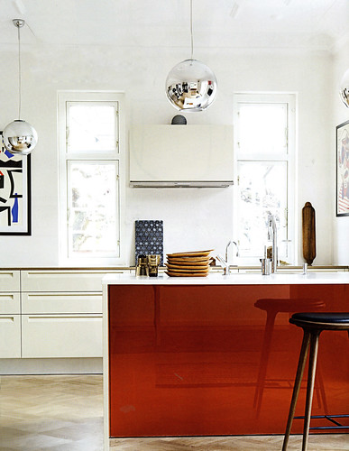
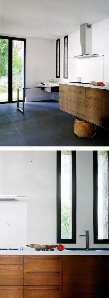
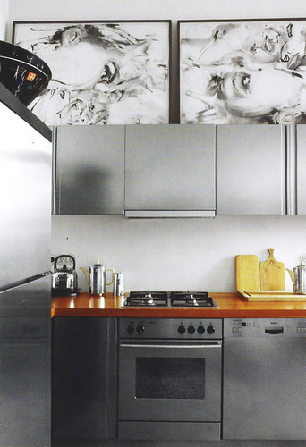
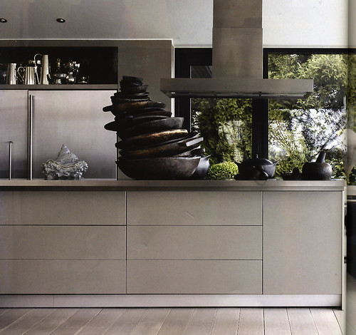
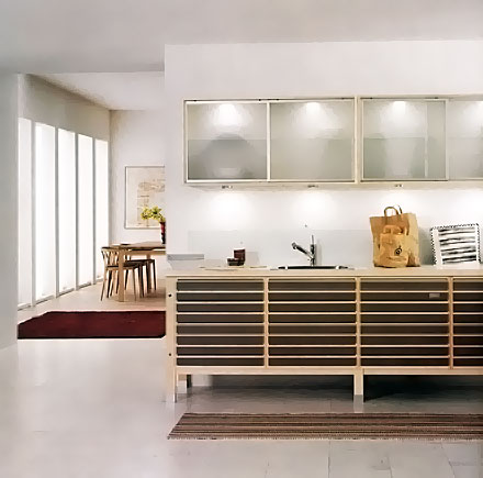
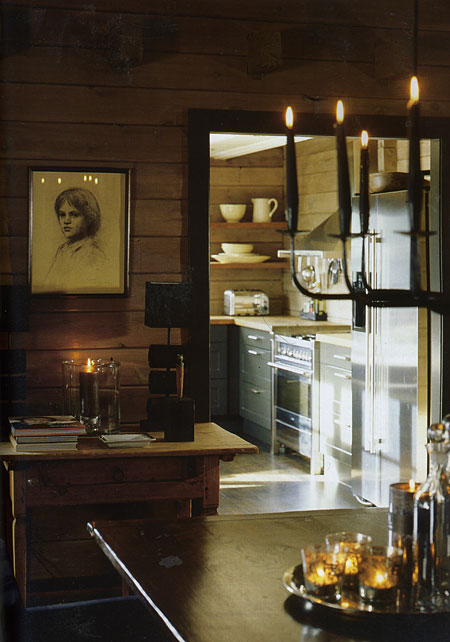
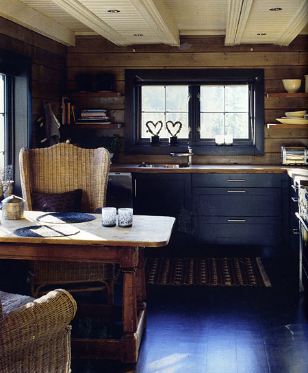
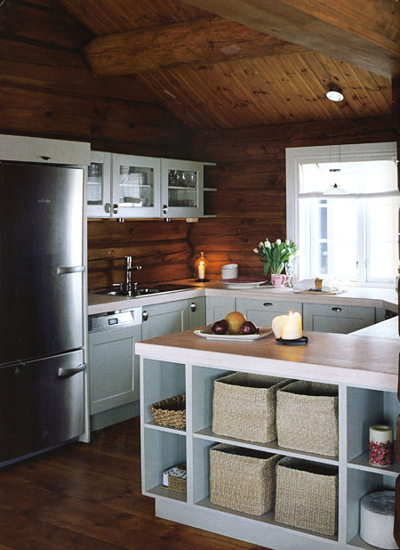
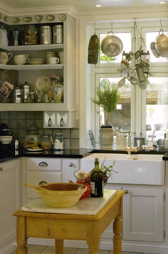
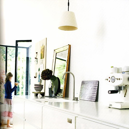
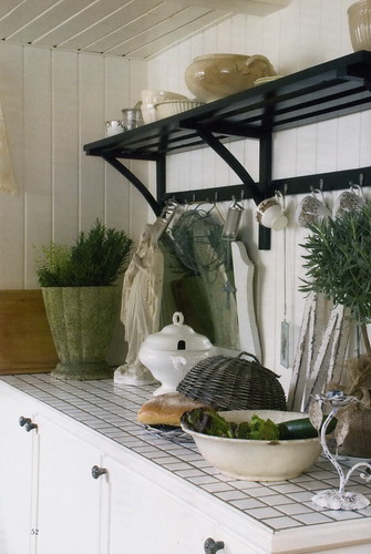
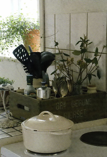
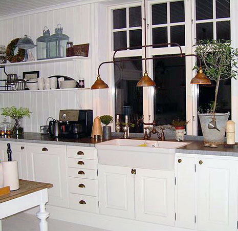
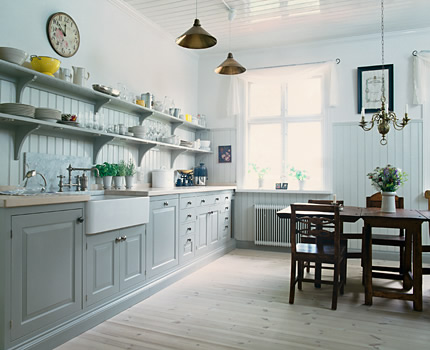
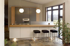
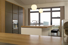
c/o The Maidstone East Hampton - Scandinavian Design

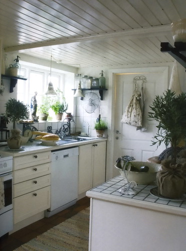
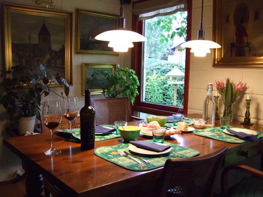
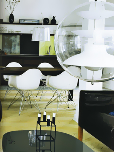
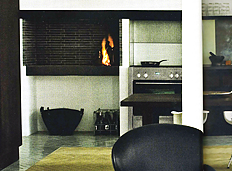
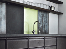
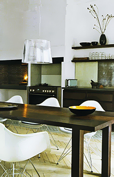
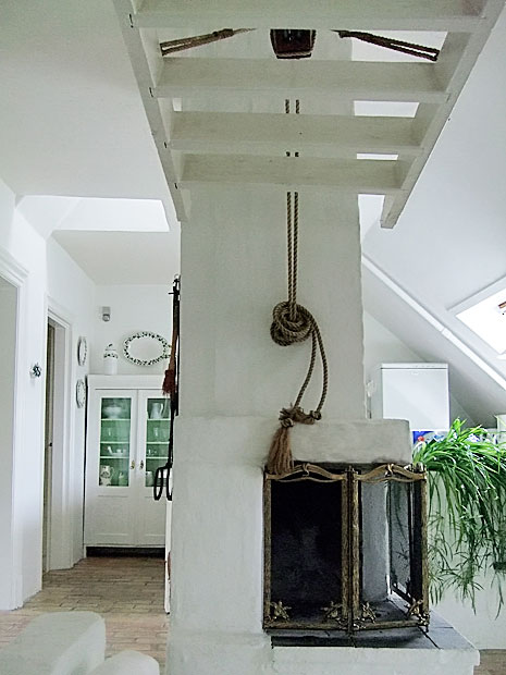
c/o The Maidstone, located in bucolic East Hampton, is a Swedish design tour de force. For design addicts and design junkies, it is a destination, a lesson in color, in light, in an eclectic historical and modern Swedish design.

At the moment, this post was further down on my list of things to do, but as is true for all of my posts, they come when I am inspired, and I just cannot hold on to these images any longer, I need to share them!

Nadia Tostoy, design director of c/o The Maidstone, desired to create a "Scandinavian cozy" theme, a historical yet modern environment. Inspired by Josef Frank fabrics, color is a foundation of c/o The Maidstone and the turquoise walls in the entrance and beyond immediately reach out to welcome a guest. C/o The Maidstone was purchased by Swedish hotelier Jenny Ljungberg, who injected a Swedish free spirit into the previously typical Hamptons "rustic chic" traditional spaces. I have had the pleasure of staying at the previous Maidstone Inn numerous times and this time we stopped by for a wonderful, lingering, breakfast, and the word "wonderful" is probably understated. This was last Saturday.

As many of you know, I have a passion for Scandinavian design by connection to my own Danish heritage and visits throughout my life to my families' homes in Denmark and Norway, so this visit was eagerly anticipated. As all the guest rooms were booked, I did not have the opportunity to see any of them, but I will in the future. 

As I study the interiors with a critical eye, well, before that, let me say that my first impression was an incredibly positive WOW...gorgeous, exciting, beautiful! I WAS excited (and I certainly still am!) As I take time now to look at my images, as in any interior, the question comes to mind...does it look "designed" or does it look like a natural compilation of pieces, particularly in the sitting rooms? To me, it looks, for the most part, carefully coordinated. For me, the standard for the evolved look is the traditional English interior which always seem to give the feeling of each and every piece having been added at a different time, but it all just blends, all the "lite" eclecticism of it. There is much eclecticism here, but it seems much more controlled. A nitpik might be that I may have liked to have seen a bit less Josef Frank. Not less color, necessarily. 
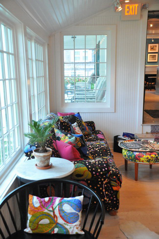
All that said, there IS much to be said as well for a controlled design perspective in a space like this. Selecting a few prominent threads to play/work with such as color, Josef Frank's textiles, the shade of gray, as themes, create a flow which serves to connect many multiple seating areas and which in this case is very interesting. There is a free spirit running rampant within these design threads as seen in the art installations, gray sheepskin throws over crisp white traditional shelving, and more which, to my eye, break rules in a very positive way. 

The juxtaposition of the dark, dark gray wall color and the extreme white ceilings and walls is, to me, perfection, and note the shiny ceilings. The flooring provides warmth in a lighter tone and within those neutrals, color chaos reigns supreme. To my eye, the antique Swedish rag rugs (I own 3, buy them here and scroll down) play a very important part in bringing a slightly worn authenticity to the space. I may have liked to have seen a bit more of that concept, just a bit. The traditional elements of the furnishings are welcome and their sculptural lines add a sort of friendly feeling. In fact, the furnishings are filled with sculptural lines, often in bright colors, which add a whimsical, yet sophisticated, look. 

For more information on Scandinavian interior design, visit Avolli, and Willow Decor. Also do not miss Emmas Designblog and PurpleArea

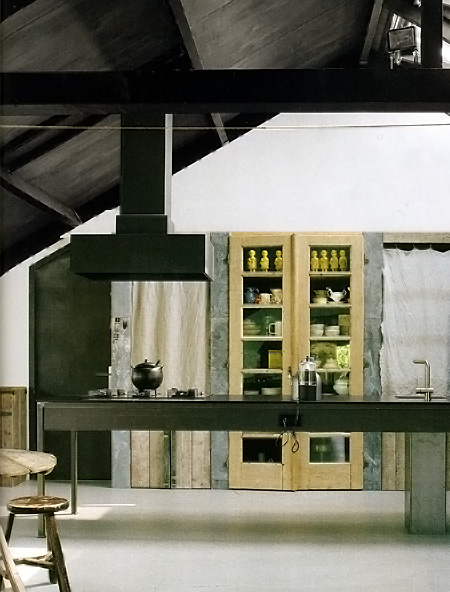
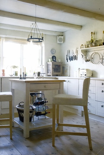
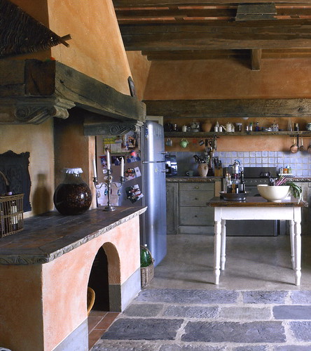
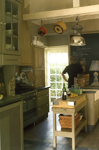
The BIG question is, what sort of kitchen would you design if we were inspired by this interior?

For Part II on this theme, I'll give you my thoughts...in the meantime, tell me what sort of kitchen you see here, and I promise I won't be influenced!

CLICK ANYWHERE ON EACH (LARGE) IMAGE AND IT WILL GO TO THE NEXT IMAGE

OR VIEW IT IN BIG BEAUTIFUL IMAGES IN THIS SLIDE SHOW


Get the flash player here: http://www.adobe.com/flashplayer

Beautiful Kitchens

Yesterday's post was a first course. Today is the entree!

It is always a pleasure of mine to show you Scandinavian kitchens, as you may know. The reason is that I think the Scandinavians have a very, very special gift for combining their modern design point of view, which seems to be in the collective DNA, (always with some exceptions) with historic surroundings or smaller traditional elements. They do it well, very well. 

If you can, go through this slide show slowly. Examine the parts and pieces of each kitchen design. Think about what you like and what you do not like. 

Some of these kitchens speak to me in a strong way, others do not speak to me at all. I do know one thing....I need about 6 houses to express myself in all my kitchen design "moods".

If you click on "notes" you will see my comments. What speaks to you and why?

Sleek Scandinavian Kitchens!

OK, it's Friday, I'm feeling good, and I want to show you some modern kitchens from my latest Scandinavian magazine collection! I've now accumulated maybe 4 or 5 subscriptions of my fave Scandinavian magazines (and don't ask me the cost of a subscription, I don't want to remember, and don't tell my husband!)

I absolutely think there are things to learn by looking outside our normal kitchen bubble, to see what else is happening in kitchen design. Let's see what we can learn, dissect, and have fun with today, and also admire. These images are from the very chic magazine Rum Interior Design.

Below: Love the simplicity, the boldness, the white foundation. I also LOVE the artwork, as many of you may know.


Below: You know, I'm noticing more doors and windows with black trim for some reason, and I like it. Liking the skinny windows here.

Below: Interesting! Sure breaks up the mundane gray everywhere and creates more importance and weight to the upper section of the kitchen. And it's fun, and fun is always good in my book.

Below: I really like this one because there is a great juxtaposition of the profuse green landscape and the modern interior. Not to mention the artfully displayed accessories. Look at that!

Below: Now, this is not normally my style, but I could move into this space! I love white, I love texture, and I love windows. I'm good. 

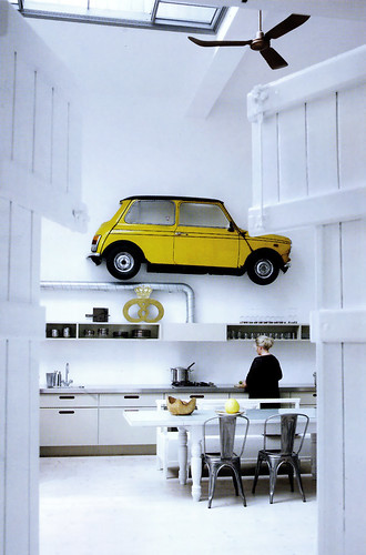
Below: And, who can't smile at this one?? I sure am! We have white, we have major whimsy going on, and a modern point of view...mostly. Love. 


And you? What do you like/not like??

Cool Scandinavian Kitchens

You all know I'm good for Scandinavian kitchens! I haven't kept up the pace on my (yes, beloved) blog as much as I should have in recent months due to several reasons, but that aside, despite the ongoing miserable economic conditions in our country as well as locally, I'm feeling hopeful and ready for a fresh start. As an optimist, which I consider myself to be, that's my job!!

I think part of feeling ready for a fresh start is the office I'm putting together. I'm thrilled with my new home office, and it's only this past week that it's been set up, really, since Sunday, and we moved December 29! Since moving in, I've only had my computer on a table, and have been very patient as we've spent these past weeks organizing the rest of the house, which we continue to do. We still have about 25 boxes to unpack, probably, out of nearly 200. But, with new countertops in the office since last Sunday, adding artwork (lots of artwork), a Stanley Steemer carpet cleaning, office supplies (it's all about the height of each inbox!) organized, I'm feeling great, and ready to go!

During this time, I HAVE collected a good number of Scandinavian magazines from visiting Danish relatives and from subscriptions of Scandinavian magazines. And, I just spent $300 on new subscriptions for Scandinavian magazines today (good thing the husband doesn't read this blog!) Want to see some?? I really want to share these kitchens with you, which are not so easily available to see and study otherwise (quiz on Monday.) ;) Sure, more varied content will come, but having just organized my Scandinavian magazines for the first time (ever!) I may be on a roll with fresh images in the coming days and weeks.

I think, unlike typically, I'll throw in some comments. Please feel free to comment too. I'd love to know others' perspectives on these kitchens. Images from Rum, Bolig and Bo Bedre.


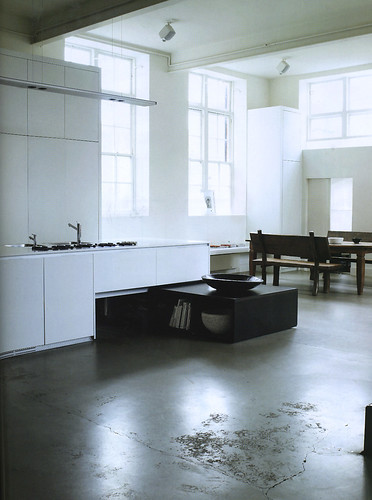
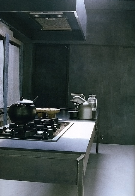
Wow, this one, below, is pretty amazing. I love analogous color schemes. Perhaps the upper section of the hood projects forward to capture the cooktop fumes, I hope so. Would like to visit, but wouldn't want to live there.

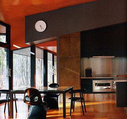
I love this, below. To me, a perfect juxtaposition of cool/warm, texture/smooth. I could happily cook in this kitchen, being among nature and steel...an exciting combination! Bright, textured orange against what looks like flat medium brown? I'm there! The clock? I'd want it larger.

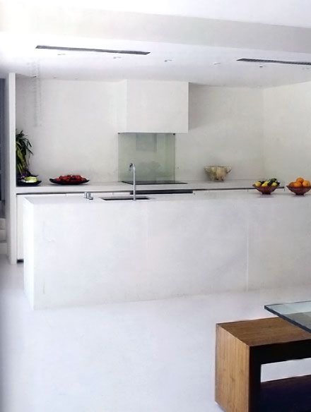
Below, ok, it's bright, but to me, depressing. I'm surprised at my reaction. Tooooo simple/bleh to feel serene (for me.) As an example of minimalist modern kitchen design, it's fantastic. But, I think I may have elongated the hood above on each side to maximize the design concept.

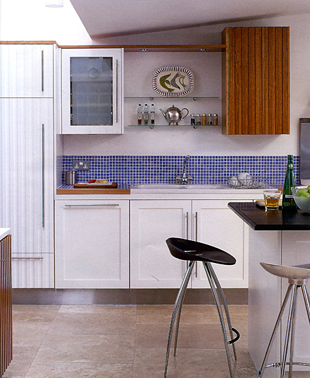
Below, sure it's IKEA-like in its feel, but I love the unexpected introduction of the ribbed white and wood cabinets, the halfway up mosaic tile, which clearly sets apart the cabinetry/shelving above as its own element, and the boldness to position the wood wall cabinet close to the angle of the ceiling, creating an exciting design feature.

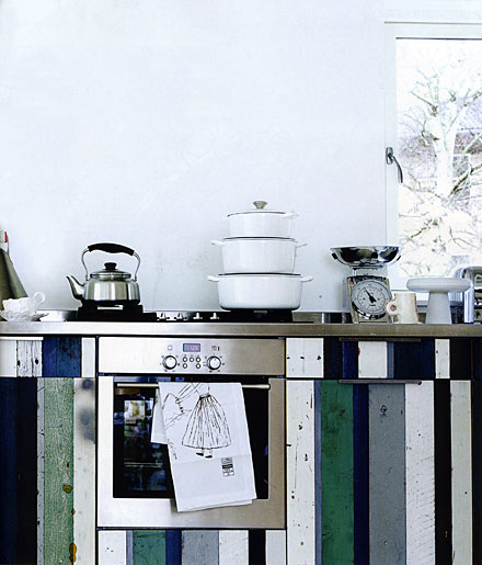
Below, no, I'm not on board with this. I see an element of fun. I get the surprise of the ornate brass lamp, but all I really see is a mishmosh!

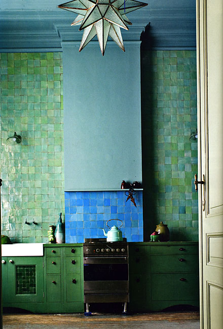
Below, yeah, I can go down this road, definitely! Another semi-analogous color scheme.

Below, very Scandinavian. Give me a little opportunity for artwork or a sculpture within the space, and I'm good! Definitely has that Hansen feel that is so wonderful.

I have more! What do you think? What's your favorite?

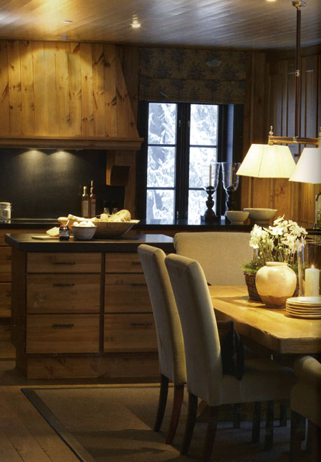
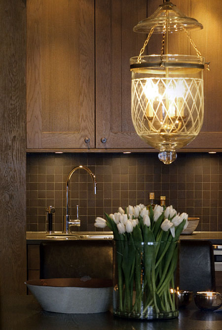
Cozy Scandinavian Kitchens

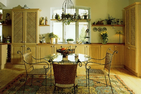
What can I tell you? I can't resist even MORE Scandinavian kitchens! I was cleaning up my desk (I probably have 100 magazines in my office) and this one recent magazine had such great images in it. They're cozy, they're woody, if not in the cabinetry, then in the surrounding walls. 

I decided to show the last image of the oak door because oak is still quite unpopular in the U.S. But, look at that finish. It's new, fresh, and very sophisticated. This is not the "golden oak" finish that we once knew. From Interior Magasinet from Norway. 

More Scandinavian Kitchens

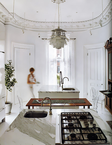
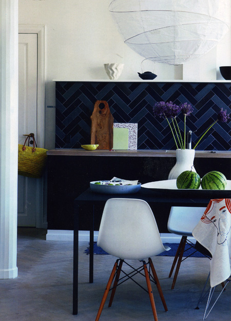
Here are some more...I haven't put someup in awhile, I'm definitely overdue. Me, I can never get enough. The look varies, but the common thread is usually "eclectic" and "modern".

Is there such a thing as a modern eclectic? That's a GOOD question! Sure, why not? If the news says the blue and red states are leaning toward one or the other candidate, I think I can say a Scandinavian kitchen often leans toward a modern eclectic look. Sounds good to me! These are from Metropolitan Home, Bo Bedre, and Bolig.

Which one do you like best? 

Cool Scandinavian Kitchens

I've been busy blogging for HomeGoods, that's where I've been! Today is the last day of that assignment. They have very good bloggers there, with endless great tips, and it was fun to be part of it. So, here we go again...!

YOU know where to go when you want to see some real, honest, Scandinavian kitchens, right? Right here! Well, I have a treat for you. Peder and Lotte, family members from Denmark, are here visiting for 2 weeks. They had strict instructions to BRING ME MAGAZINES, AS MANY AS YOU CAN CARRY! Of course, with those strict instructions, I end up getting only about 4, but that's ok, I'll take them!!

Without further ado, let's take a look...oh, before I go, I've spent a bit of time, just a bit, in our apartment in the city in the past few weeks. When there, I always get lots of awesome magazines, so I think we're going to be looking at some very hot kitchens in the weeks ahead, so check back. Good?

I'll start with the cooooool Scandinavian ones...hope you're all well! Tell me what you like. Bottom 2 images from DesignLiv Middle two images from Bo Bedre, and  top two images from RUM Interior Design. 


Scandinavian Kitchens - End of Summer Edition

I've been collecting images here and there since August, when I thought I'd do a dog-days-of-summer-dreamy-white-kitchens post and, again, was so busy with these two kitchen orders that I could only procrastinate just a little and collect the images, saving them for later. Well, finally, today is the last day I am working on these orders after a summer of finalizing them, believe it or not, but, I digress. It's been intense!

Here are some dreamy kitchens to make you happy, I'm sure, as that's the effect they have on me! Each image has the name of the blog that they are from (all Scandinavian blogs, they're fantastic to look at) so enjoy them and I'll be back to you, now, regularly. That's my plan!


Kitchen Eye Candy

I need some kitchen eye candy. I've worked solidly for two days (this weekend.) Tons of detail work doing an electrical plan, plotting very specific dimensions for lighting and appliance centerlines, switching, and receptacles, only to have beams be in the way, I'm sure! Also, uploading plans to my out of state clients.

I also designed a kitchen within an entire space, designing around a structural column in the middle of nowhere, adding in furniture for the family room, again for context, as it is important to understand the negative space as one moves around furnishings, cabinetry, etc. That negative space is equally as important as where to put kitchen cabinets! You have to see it all. Remember that, in your great room design adventures...do not forget to have the surrounding spaces/furniture drawn into your plans. Otherwise, you're driving blind, so to speak.

But, I'm wild about my monitor. It's truly the best thing I've done for myself in years! So fantastic, so crystal clear, so vibrant! But, I digress...I need some mindless kitchen eye candy, so let's look at it together and think some really luscious kitchen thoughts...Scandinavian kitchen thoughts, something I have not shown you in some time.

From Vakre, a magazine so beautiful on every page, I can hardly describe it...

My Danish Families' Kitchens

Today is Christmas, I'm the only one up right now. The cold is surrounding me, a candle burns, and I think warm thoughts of my family in and around Copenhagen. I've spoken to a few via email and phone, an uncle who called last night at midnight his time, 7 pm (I think) our time, when he knew our U.S. family was all together. Sweet!

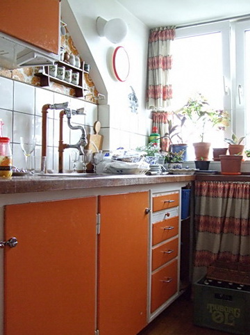
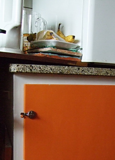
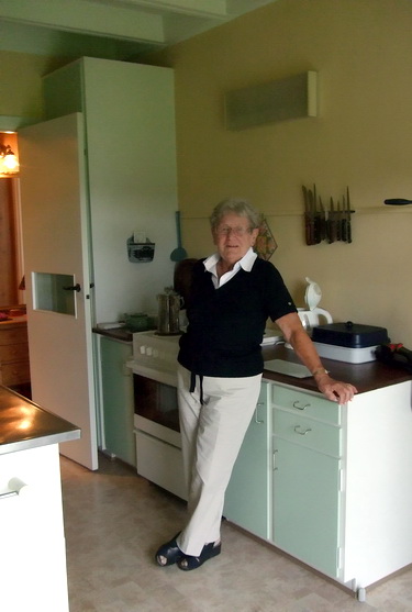
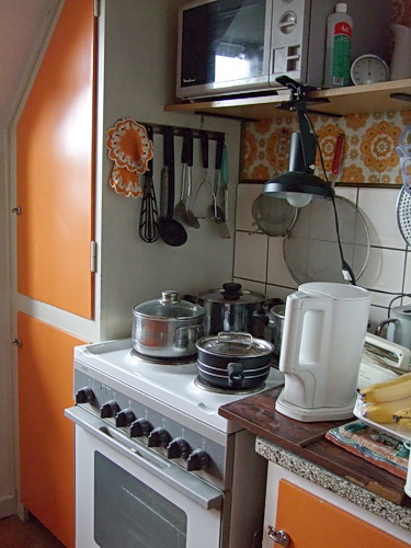
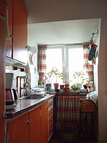
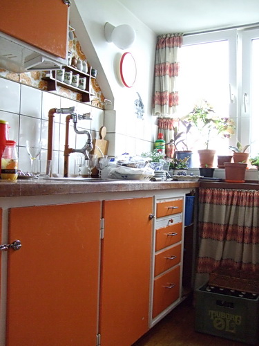
I think of my cousin's daughter (my second cousin?) who just had twins in October with her (married) partner, one of the twins who has been hospitalized since then, having several heart operations. They skipped Christmas at my cousin's home, choosing to stay at the hospital. And, at the other end of life's journey, I think of my uncle who just had his 94th birthday and lives alone, and happily, in his apartment, the orange kitchen seen below. Also, of another uncle and his family who will visit and dine today (12, in a very small dining room) at an aunt's small, log cabin home, overlooking the sea.

Near or far, family is what life's about. And, as we all know, a whole lot of life happens in the kitchen! So, here we go, take a look at some of my Danish families' kitchens, and dining areas, who, I'm sure, have been busy preparing tasty meals for the days surrounding Christmas. Images taken in August '07. Enjoy YOUR holiday cooking, food, dinners, and gatherings!


A Kitchen Treat

Happy Halloween! In honor of this holiday, which could go either way, depending on my mood (tread carefully today) I'll give you a treat, rather than a trick! Take a look at this (appropriately pumpkin colored) kitchen. How charming is it?? A perfect kitchen for today, October 31, with it's warm, cozy, colors and materials.

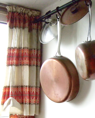
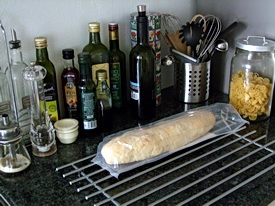
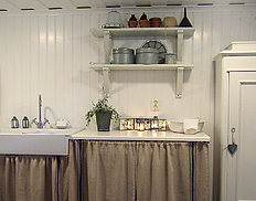
I do believe this kitchen has not been changed for quite a few decades! I really should find out how many decades. It is used every single day by Thorvald, my (very active) 93 year old uncle in Denmark. Images were taken in August when I was there on vacation. I've seen this kitchen all my life, and this trip was the first time it occurred to me to photograph it. I'm so glad I did. Don't you see a life well lived? Notice the case of Tuborg beer in front of the curtain in the fourth image-he's always ready for guests. :) Enjoy this special treat!

orange%20kitchen.jpgorange%20kitchen%202.jpgorange%20kitchen%203.jpgOrange%20kitchen%204.jpgorange%20kitchen%205.jpgorange%20kitchen%206.jpg 

White Kitchen, White Home

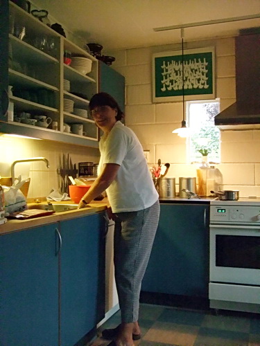
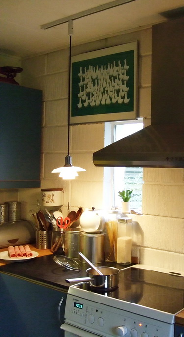
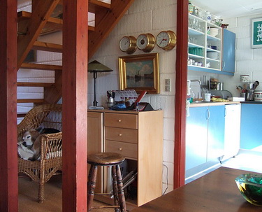
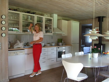
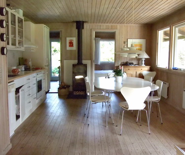
rie.JPGNot only is the kitchen white, but most of the home is white too. With accents, texture and little bits of color, it adds up to a gorgeous look. The home we see, today, is my cousin's home, just down the road from the Queen's summer castle in Denmark!

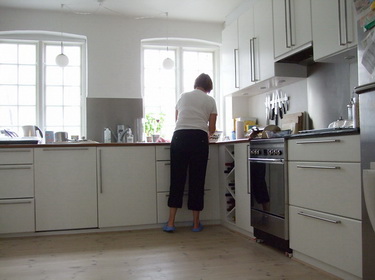
So, yes, we have another white Scandinavian kitchen...we cannot have too many, I think. Enjoy the tour of my cousin's home. She has two small children, and the woman you see in one of the images is her mother, preparing dinner. Oh, the house is 150 years old.

Please enjoy this slide show and tell me what you think!  

Scandinavian Kitchen - Luxe Living

1445484412_268baf7ae2_o.jpg

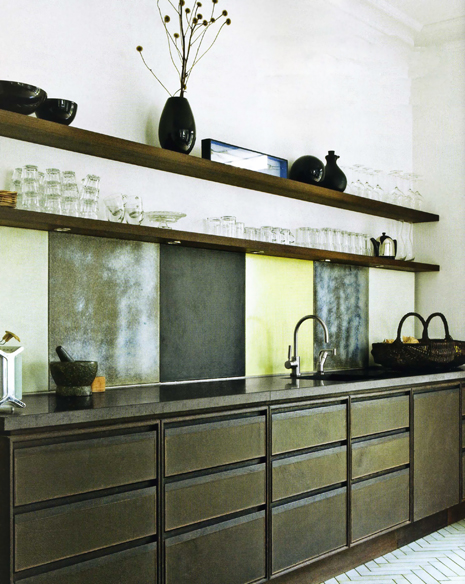
OK, I think it's time for another really fabulous Scandinavian kitchen! I haven't put one up for quite some time, I'm very much overdue and wow, do I have a fantastic backlog of kitchens to show you over time, so stay tuned! I can't tell you one single thing about this kitchen, as, sadly, my parents never taught me Danish! But, since pictures are worth 1,000 words, I'm sure you'll come up with some of your own descriptions. Me? I think this kitchen is quite awesome. Love the texture, the rich feeling of the cabinetry color, the sharp, white, accents, and always a favorite to look for, the lighting. Images from Bo Bedre.

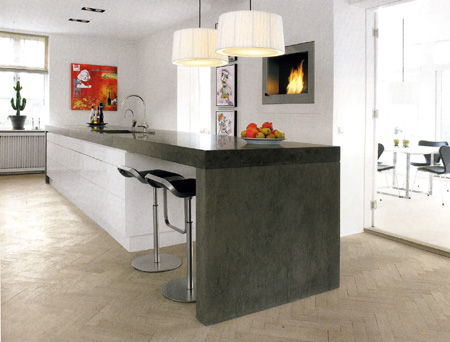
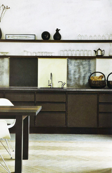
Maybe it's because I went back to Denmark, I'm not sure, but I'm loving light oak herringbone floors right now. They are everywhere, for ages, in Copenhagen, but I think there is a (small) resurgence in herringbone flooring patterns in the U.S. It's a fresh, attractive, pattern and texture to use in wood flooring. I also love the shelves in this kitchen. Anyone else see herringbone patterns heating up? Enjoy!

http://farm2.static.flickr.com/1151/1445484302_01c6a8310a_o.jpghttp://farm2.static.flickr.com/1203/1444622231_5b8b61faa3_o.jpg
http://farm2.static.flickr.com/1427/1445484832_3b999980ef_o.jpghttp://farm2.static.flickr.com/1184/1445484962_7ac6301c02_o.jpg
1445484696_a7a32b4b16_o.jpg

The Scandinavian Style Breakfast Room

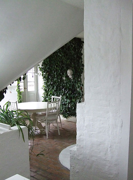
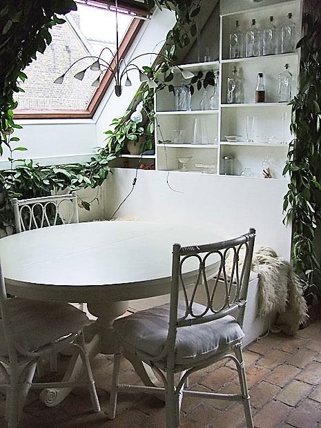
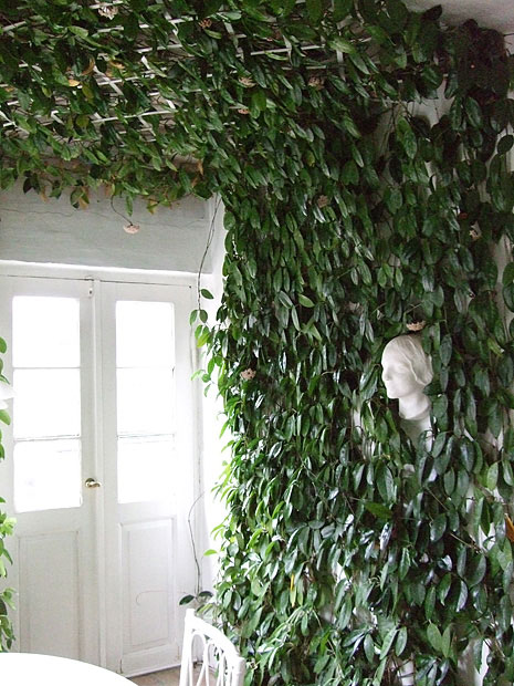
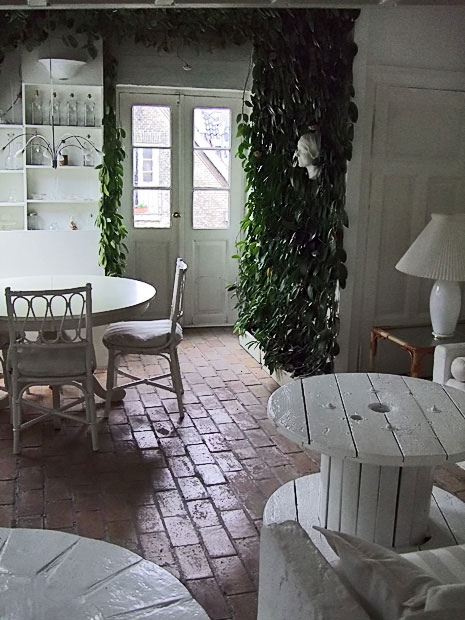
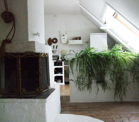
There was one photograph, similar to what I took below, that made me very quickly email the realtor back to say, "book it!" What is not shown so well is this structure of sorts that has a curved, stone, thick, back to it and the front is seating, like a curved sectional. It is situated in the perfect spot, and definitely a surprise in this room.

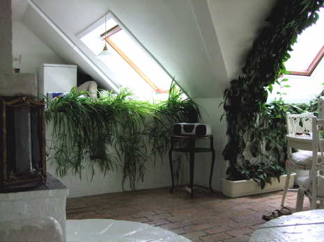
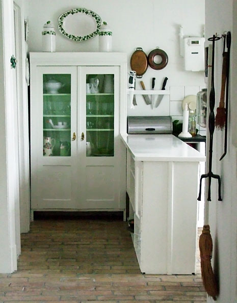
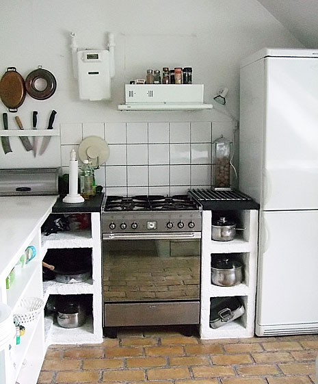
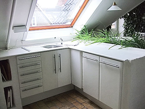
There is a variety of interesting elements in this room...the brick floors for one. These are real bricks, not veneer! I've never seen this used as flooring in a kitchen, a real kitchen. I'm a barefoot walker around the house, and it did not bother me to walk on this floor. Of course, the plants on the walls and ceiling are crazy!  It certainly was THE most interesting breakfast room I've ever had the pleasure to dine in.

And, always white, everywhere, as the perfect shade to complement these colors of nature, the brick and the green plants. Simple, not "decorated" per se, just sort of accumulated elements, creating a comfortable space.  

What makes a breakfast room/kitchen dining area great? I think one way (not the only way) as we see here, is to create the quality of the space feeling "real," not contrived, but to show an authenticity, with a goal to delight, and ignite, the senses. It's one particular look.


Did you say you wanted at least SOME accessories to integrate into this look?? Ok, come with me over to Desire To Inspire's second day of shopping the antique boutiques for some very wonderful furnishings and accessories to get this look! Thanks DTI! 

denmark-kitchen-10.jpg denmark-kitchen-1.jpg Denmark-kitchen-2.jpg denmark-kitchen-3.jpg DSCF1355a.jpg

White Kitchen - Scandinavian Style!

I haven't really shown you any images from my trip to Copenhagen yet! I have so many....over 2,000 to be round about precise (call me obsessive, I'm guilty!) And, let's not forget my 10 (at least) magazines too. Lots of good stuff. Don't get me diamonds, just get me a Scandinavian interior design magazine! (I didn't really say that, right?)

Speaking of good stuff, I went a little crazy with taking lots of images of this very soft, romantic, Scandinavian style that everyone loves so much. I found this wonderful style (so much style) in some very special antique stores, Atelier September and Fil de Fer.

I have shared these particular images with Desire To Inspire, my good blogging buddies, because they have featured one of the stores before and I thought they would enjoy them, a fresh look from being IN the stores. I think they enjoyed them so much that they are doing a feature today AND featuring more, and different, images tomorrow! 

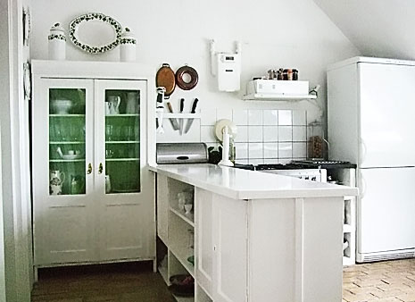
What's missing is the kitchen! The apartment we stayed in, in Copenhagen, definitely had this same romantic style going on. I saw pictures of it online and booked it immediately! I just HAD to stay there. So, here is a kitchen design connection to this romantic Scandinavian style that Desire To Inspire is showing.

Today I will show you the kitchen, tomorrow, I will show you the adjacent breakfast room which will make you fall right over!

Don't forget to check back with Desire To Inspire tomorrow too, to see the complete look, connected with my images here.  

Here are previous posts in Desire To Inspire...on Scandinavian Style  and more Scandinavian style and good Danish design too. I would encourage you to use the search tool in their blog, but watch the time, you'll be there all day!


denmark-kitchen-4.jpg denmark-kitchen-8.jpg denmark-kitchen-7.jpg denmark-kitchen-6.jpg denmark-kitchen-9.jpg denmark-kitchen-5.jpg

Thank you blogging buddies!

DSCF0972a.jpgI think I'm the only one I've come across who refers to "blogging buddies." I do like the sound of it! I would like to thank my blogging buddies, Holly from Decor8, the gals at Blink Decor, and Linda from Surroundings, for showing my kitchen design work and/or my images from Denmark.

Thanks to Blink Decor for showing the images of my currently published kitchen. I'm glad they enjoyed it! I have to take a moment to say that I'm really crazy about the layout of their blog. I love the colors, it's very exciting, it always revs me up, and it's very user friendly. Good stuff on there too, and always thoughtful and informative advice. Thanks, gals.  

Thanks to Holly from Decor8 for creating that big, fantastic, post on Danish home interiors (images from some of my familys' homes) and for showcasing some of the great, Danish, furniture that I photographed in the fine, home furnishing stores. My cousin's comments on sources and designers of her home furnishings are very interesting. What a thrill to be on decor8! It's always a destination for me. Need to keep up to date and see what's happening design-wise!

And, last, but definitely not least, to my very good blogging buddy, Linda, from Surroundings. I laughed out loud when I saw the title of Linda's post, about the rotten state of Denmark, and wish I thought of that myself! Thank you Linda, for both showcasing my white kitchen and for linking to the Danish inspired posts on the blogs. Always a go-to source for interesting, eclectic, design information, and, I appreciate the mentions, Linda (each live link links to a different post). Surroundings takes the pulse from many sources and makes sense of it all to the rest of us!

You know, I really need to ask this question. Due to the enthusiasm over "things Scandinavian," I am often confused, because I'm SO tied into the culture and the beauty of it all. So, tell me, what do you all love about it? Do you see Scandinavian design becoming even more of a factor in today's design interests? Do you see it moving forward in everyone's design focused radar screens? Or is it just the classic beauty of it which will always be appreciated? Is everything old new again, or is it fresh, new, Scandinavian points of view that you are seeing? I'd really love to hear your thoughts.  

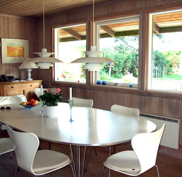
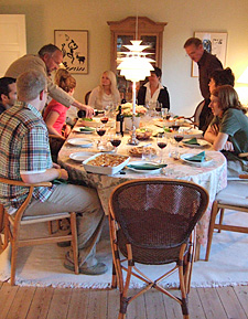
The image is my cousin's dining room, with some of our family, a beautiful Danish home interior.


Scandinavian Kitchens - Open Shelving Ideas

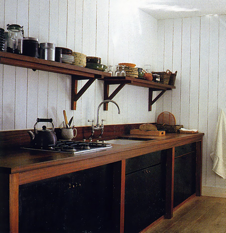
Something I already knew, which was confirmed at KBIS in May...open shelving is HOT! It adds that warm touch, anyway it's done. Although, there IS an art to the arrangement of objects on open shelving, very much so. I designed my own kitchen (meant to be temporary, and here it is 4 years later) with lots of open shelving of various types to allow me to be surrounded by my collections. FYI, in the first image of my kitchen, the objects (all mine) were artfully arranged by the stylist on site when my kitchen was shot for publication last year, so I can't take credit for that! But, I digress.

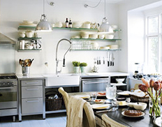
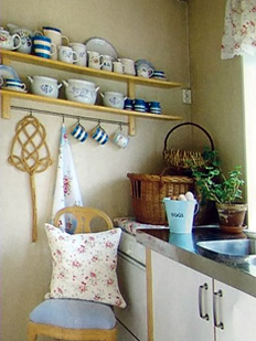
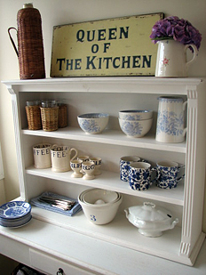
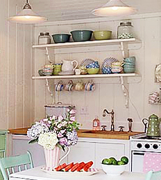
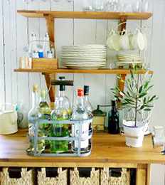
Let's call today's journal entry, Scandinavian Wednesday, rather than Monday (late again) and take a look at how the Scandinavians "do" open shelving. They're very good at arrangements, the shelves themselves, and creating a look and feel of real warmth. Today we'll look at traditional shelves and arrangements in the kitchen.

It's not really difficult to put items on a shelf, but one may want to think in terms of "layering" the shelf. Put something behind, perhaps a plate, platter, or a piece of artwork, then something of a different color or texture in front of that, or monochromatic items if that look is pleasing. Books stacked sideways is always lovely, and a piece on top of the books, and so on. For me, it takes some time arranging until I'm happy with the look. There is volume, color, texture, proportion and balance to consider. Sometimes there are happy accidents, other times, it has taken precious time.

Next week (if I remember!) we'll look at shelving in modern kitchens.

Images are from left to right from the top down as follows: First, from lantligt, second, from boligmagasinet, third from sol-solstad, fourth, from Karna.sprayblogg, fifth, from Savannah-beach, sixth, from Masan Shabby Chic, and last but not least, from min lilla veranda.

Oh, I hate when I forget a detail, that's why it's also good for my subscribers to come to the blog to see if I've added something...take a look at the entire Scandinavian Kitchens category for more inspiring open shelving ideas! Heck, look at all the kitchens on the blog!  :-) 


http://www.pbase.com/susankbp/image/83211097.jpghttp://www.pbase.com/susankbp/image/83211109.jpg
http://www.pbase.com/susankbp/image/83211131.jpghttp://www.pbase.com/susankbp/image/83211148.jpg
http://www.pbase.com/susankbp/image/83211156.jpghttp://www.pbase.com/susankbp/image/83211160.jpg

Kitchen Accessories - Scandinavian Style!

I think it's time to trick out the Scandinavian kitchens that we're loving every Monday (ok, it's Tuesday, skipped right over Monday)! As innovative as the Scandinavians are with their design and decor with such a rich history to draw from, that innovation and great design has also historically reached over into housewares in a very big way over many decades. It seems there has always been some item that's been hot, a "must have." Even recently, we've seen a large introduction of Danish crafts in the MoMA store, and others just devoted to Scandinavian housewares. Here are a few bright and fun items that reflect the Scandinavian point of view.

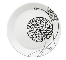
First, look at this dish pattern from Scandinavian Details. From the site: Kristina Runske, founder of Scandinavian Details,returns home to Scandinavia several times each year to connect with emerging designers and trends. Her commitment to bring you superior craftsmanship matched with leading-edge technology and environmentally-friendly materials can be seen in each of the products she personally selects for this thoughtful collection of clean, clever, contemporary objects for modern living.

scandinavian%20details.jpg 


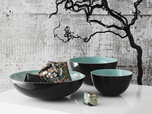
All right, I admit it. I selected this next piece for several reasons...yes, I love the background, but more than that, look at that wonderful turquoise. And, ok, I'll also admit that turquoise has been my favorite color for decades! So, there you go. But, it is such an elegant, simple, and useful piece from Tivoli Home. From the site: We are a couple of Danes who love to share our passion for good design from Scandinavia.

The store is located in the Dumbo section of Brooklyn, such a delightful area, worth a trip.

 tivolihome.jpg
And, next, I found this great site, Fjorn Scandinavian. From the site: Envisioning a collection that was both elegant and soothing to the senses, Sigurd and Ann sought out the most beautiful Swedish table linens, the softest and warmest hand made woolens, lovable children's things, cozy, colorful blankets and sweaters in an array of great designs, and tableware that reflects the Scandinavian Good Life.


Take a look at this beautiful table runner. I love table runners, and I don't even use them enough. I grew up with table runners, as it is a common Scandinavian part of the table. 

fjorn%20scandinavian.jpg
OK, here's a kitchen you can use them in! Some kitchen inspiration....

 kvanum%205.jpg


All these companies have wonderful products and contribute in a big way to the entire fresh, organic, Scandinavian look. Enjoy! 

Scandinavian Kitchen Design ROCKS!

I'm not kidding about this. It really rocks, trust me. Take a look, and turn up your speakers. A LOT. It doesn't always work for some reason. Refresh your browser if you don't see the video right away. It's short but unlike anything else I've seen!

Scandinavian Kitchens That Rock The House

Or try this link, but try it! (And then report back!)

My cousin, Lis, sent me some links for Scandinavian kitchen websites, many of which I already had, but some were new. I had asked her to send me some magazines, and she said links are easier. Nice! I'll be loading up on magazines when I go to Denmark in August. I usually spend at least $100 on magazines, and they add so much weight, but it's worth it (to me!)

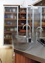
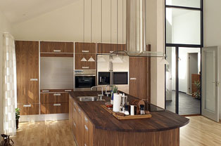
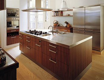
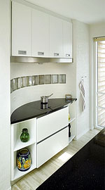
Here are some thoroughly modern kitchens from the company, Trend. The wood really looks fantastic here, doesn't it?

trend-1.jpgtrend-2.jpg
trend-3.jpgtrend-4.jpg
trend-5.jpgtrend-6.jpg

 
And, as always, try out a few blogs. The first, Modern Country, has text in brown in English. Also check out hvitstil, and last but DEFINITELY not least, Karna.