There is an apartment building, hmmm, can it even be called an "apartment building"? I think not. Perhaps I should use the word "residential tower", at New York City's fabulous upper west side address, 15 Central Park West, nearing completion in the months ahead.
 For the benefit of my readers outside of New York City, unfamiliar with this famous street, Central Park West is arguably New York City's most architecturally renowned residential street, having been added to the National Register of Historic Places in 1982. The residential buildings along Central Park West are grand, having been developed and built shortly before the depression, during a positive building era of "let's party till it's 1929". The new residential building at 15 CPW, is designed by Robert A. M. Stern and developed by Arthur and William L. Zeckendorf (brothers).
The celebs who have already bought into the residences are:
- sting
- denzel
- jeff gordon, nascar
- norman lear
- one half of the google duo
- and of course, hedge fund managers and Goldman Sachs big shots
My source, a little birdie, inside the building, told me of a sighting of Oprah and Gail, both in hard hats, touring the space. Read more about this building at Triplemint, at Curbed, and at the building's own website, 15 CPW.
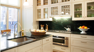
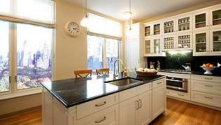
 Now to the kitchen in the model residence. Which brings up a very interesting question. How do you design a kitchen for the residential model in this building? The kitchen was designed by Robert A. M. Stern, the building's architect. The state of current kitchen design styling must play a part in some way, along with the need to be sympathetic to the architecture.
It makes me wonder, going 5 years back, with all the columns, corbels, and pilasters seen in every kitchen, if that sort of decorative detailing would have been the style of choice. After all, who would even go down that road to have a 1920s kitchen designed? You couldn't. It was a small, non descript utilitarian space, a kitchen in the 1920s.
 15 CPW is certainly a grand building, and can handle a grand kitchen, with much decorative detail. Yet, I see the architect used restraint. And, I also see, the design is right out of the movie, "Something's Got To Give", which launched a huge movement to a traditional style kitchen that used to be called Shaker, and is now, what I refer to as a "butler's pantry" kitchen, a style popular still today with my clients, several years later, in fact, gaining momentum as a fresh definition of traditional kitchen design and styling.
I would have had a different design interpretation, had I designed the kitchen for this model in this impressive building. I would have added more interest in the form of simple, elegant, millwork detailing here and there around the cabinetry, yet still maintaining restraint, which would not break the bank (if anyone cared about the bank). I might also have recessed the cabinets above the cooktop 2 1/2 inches, to more easily define this area as a focal point, albeit a soft one. I would have put two pieces of hardware on the long drawers, probably used different hardware, and most likely, bring the cabinetry to the ceiling, and I would have had a conversation with the pantry. Other ideas are floating around as well, all simple, but appropriate and elegant enhancements.
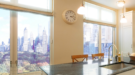
White cabinetry seems to have been used to capture and reflect light, as this room is all about light. And, the green marble, probably from Vermont, of course, reflects the beauty of Central Park, just beyond, as does the wood floor. The kitchen materials and colors are as closely related to the view beyond as it can be.
Sadly, I was not called on to design this kitchen, but I AM available to those in the list above!


