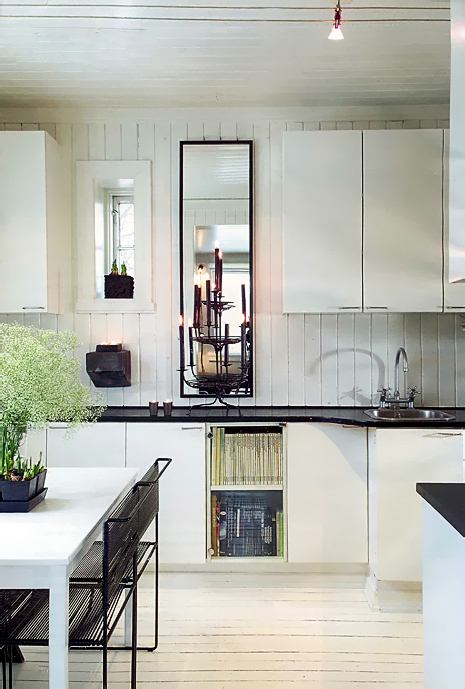
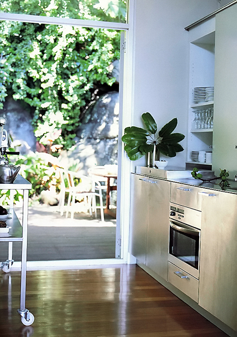
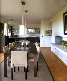
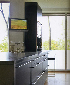
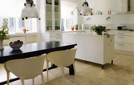
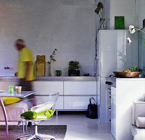
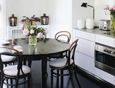
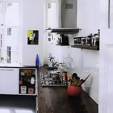
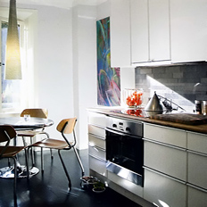
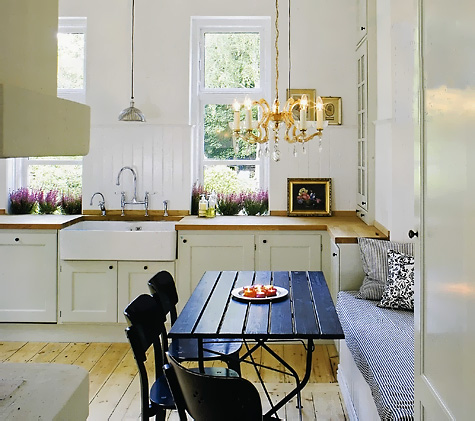
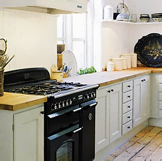
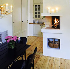
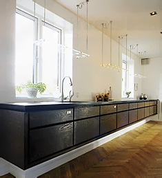
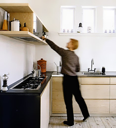
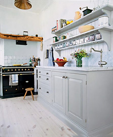
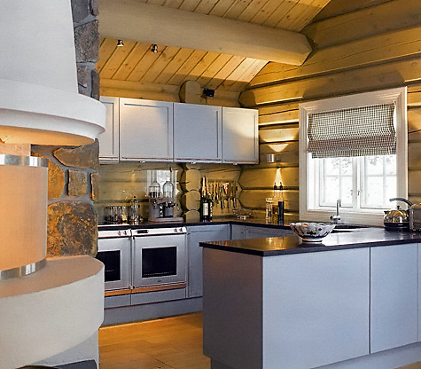
Scandinavian Kitchens and Independence Day!

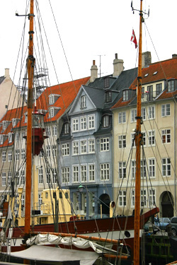
It turns out it's perfectly appropriate, and I even wish I had planned it this way, that I'm two days late for my weekly Monday Scandinavian Kitchens exhibit. Today, being, July 4, Independence Day, is the perfect tie-in to dedicate this post to my parents, who came from Copenhagen to the U.S., at that time, sailing past Lady Liberty, to pursue the American dream.
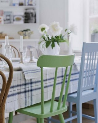
chezlisen.blogspot.com2.jpgMy parents, especially my mother, wanted to assimilate as seamlessly as possible into American life. She quickly found a church to become a member of, got involved in school and PTA activities, made lots of genuinely good friends and was happy to gain citizenship and to feel like an American. My father founded a business, made his fortune, later lost it all, blaming it on unions, also typically American! I lived the American dream growing up, and while assimilation was important to my parents, the wonderful Scandinavian cultural traditions remained intact. Food, the language (between my parents), the fantastic Danish modern furnishings, the special Danish sense of humor, and more, remained inside the home as I grew up. To think of the furnishings that were thrown out in later years, I can't go there! I was raised in two cultures with perfect balance and proportion.

So, hats off to my parents and those who dream of a better life in the U.S. I still cannot imagine the pain there must have been to leave one's home country, family, friends and all that is precious, but the promise and draw of the United States surely burned strongly then and burns ever stronger in so many people dreaming of living in the U.S. And, the dream of a better life became official on July 4, 1776!

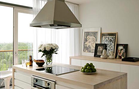
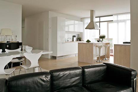
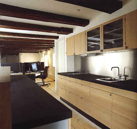
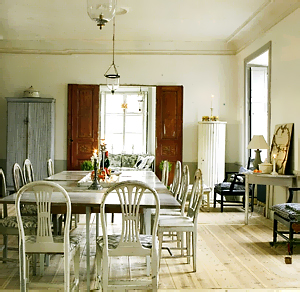
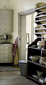
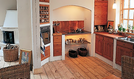
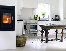
It is with great pride as a Danish-American, that I share with you some simple, yet lovely, vignettes of Scandinavian kitchens, with a little bias toward dining together, on this July 4! Enjoy! 
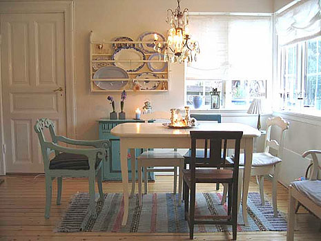
huset-fullt-a.jpg 

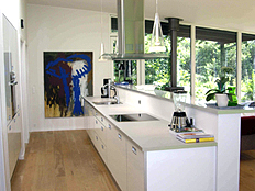
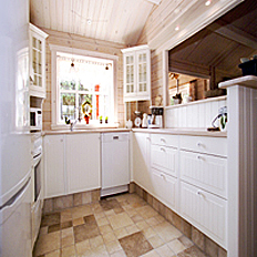
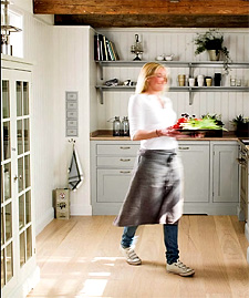
Here is my cousin Lis in her kitchen in her and her husband's summer house.  A great memory:
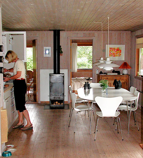
Lis.jpg 

 The top image is from the wonderful blog chezlisen and the next image is from Huset Fullt adnother enjoyable Scandinavian blog!

Scandinavian Kitchens - Summer Fresh!

Since my last Scandinavian Kitchens post, summer has arrived! Summer, to me, is one of those extreme experiences in many ways. I wouldn't want it all year, I like it just long enough to really enjoy it fully. I happen to like the summer garden better than my huge spring rose flush with thousands of rose blooms. Likewise, eating any meal of the day al fresco enhances the dining experience and creates summertime memories.

As another summer solstice-inspired change, I lightened up the look of the blog a little bit...also more light filled and clean for the summer. I hope you like it. 

Here are some fresh, summery, Scandinavian kitchens for you to dream on (ok, put wireless in the backyard and then bring your laptop, jump in the hammock, and dream that way!)

 Scandinavian%20Kitchen039.jpg

Scandinavian%20Kitchen037.jpg 

scandinavian kitchen038a.jpgvakre hjem.jpg


Denmark%2005%20632ba.jpgI'm especially excited this week because just this morning I found and booked an extremely (that word again) charming apartment in Copenhagen for our vacation this summer, for 2 weeks.

Made the plane reservations first and then began the search for as perfect a place as I could find. Think real brick floors and whitewashed stone walls. It's near the palace, a park, the harbor, and the street with the finest mid century furniture and art galleries.

You'll see pictures of that Scandinavian kitchen and others for sure. In fact, you'll get lots of beautiful images. I'm hoping to get a shot of my mother's cousin's kitchen in her tiny, hand built log home on a hill overlooking the water. That's a special kitchen!

There is truly nothing like Copenhagen in the summer. Unless it's in the winter!

And, as usual, Scandinavian blogs for inspiration this week are designe, interiorhuset, and Karna. Enjoy!

Scandinavian Kitchens - vacation villas!

Well, I guess I took an unintended week of vacation from blogging...very busy week last week! But, more about that another time. After all, clients ARE #1!

I'm toying around with the idea of going to Denmark on vacation at the end of August. Which got me into the vacation villa, or "summerhus" as it's called, rental mode. A great place to look at REAL Scandinavian kitchens.  I found some lovely kitchens that may actually make you want to COOK while on vacation, do you think? In any event, surely, the design, and openness of a kitchen plan is conducive to happy and casual living in a rental. Who wants to be isolated in an entirely separate room if you don't have to be. A perfect reason to search for an open kitchen plan. Please go to nice summer and take a look. Oh...click on "Luxury Cottages."  Nice start.

sommerhus_638_3657.jpg2701.jpg
nicesummer.com114.jpg1813.jpg


I also found this great kitchen at klmdesign.dk.

klmdesign.dk.jpg klmdesign.dk1.jpg

Scandinavian Kitchens - Beamed Ceilings

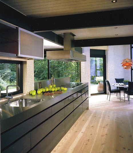
There are many Scandinavian kitchens which have beamed ceilings. There are many old buildings, both apartments in the city and old farm homes, which have beams used as structural timbers in the home. Of course, as said before, Scandinavians beautifully mix their contemporary design aesthetic with these old beams, (or in this one case, contemporary styled beams) and they do it with style and confidence. Thus, a home with truly rustic elements does not have to continue this look of "country", even if the floors are old, the walls are textured stone, as well as the ceiling with ancient beams. Some old structures have low ceilings. In these homes we will see beams too, but they may be closer to the ceiling, more shallow, and perhaps painted a light color, looking into blend in, another great look. Enjoy these images, and please look through the previous images in this category in the sidebar to see other great beamed kitchens. Top image is from Tidens Bolig, second image from Bo Bedre. And, again, here's a great Scandinavian blog: Min Lille Veranda.

A blog bonus for today is a recent blog entry by Holly at Decor 8 on Scandinavian design blogs. 

Scandinavian%20Kitchens%206006.jpg


Scandinavian%20Kitchens%206007.jpg


Sleek Scandinavian Kitchens

After a 2 week absence due to the KBIS show and other things thrown into the mix, it's good to be back with Scandinavian kitchens on Mondays. Here we go!

Here are actually two kitchens, but one has a lot of images. I'd like to take a minute to review what makes them Scandinavian in nature and what is also not only cultural, but good design.

 Scandinavian%20white%20gray%20wood%20kitchen040.jpg

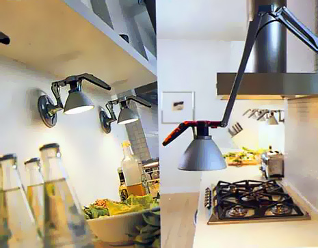
The first concept is lighting. Scandinavians love interesting lighting, and lots of it. So, the lighting fixtures must be well designed as well as highly functional. Task lighting is huge in Scandinavia. There are little light fixtures anywhere and everywhere. So, take note of the lighting.  

scandinavian white gray wood kitchen038.jpgscandinavian white gray wood kitchen039.jpg

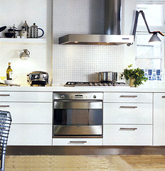
Second concept is "shapes and forms". This is a more architectural concept, which can be seen, for example, in the mosaic tile wall behind the cooktop and elsewhere. Scandinavians do not fear blank walls, and in fact have used them as part of their design work for a very long time, long before this idea became popular elsewhere. It is the "less is more" effect. Always simplicity and elegance combined, as a functional artform, the essence of Scandinavian design.

scandinavian white gray wood kitchen036.jpgscandinavian white gray wood kitchen041.jpg

Third concept today is something old or hand crafted. Notice the floors, or the wonderful pottery or other items. Some items are old and speak of texture, repetition, or pattern, as we see here as well. There is thought and whimsey both present in Scandinavian design. Nothing is taken too seriously. That seems to be an inherent truth. Enjoy, and I'd love your comments too...

 And, as always, another couple of great Scandinavian blogs.....Lantligt and Karna.


Scandinavian Kitchens - Today's Mix

scandinavian kitchens color030.jpg

Today we have a little bit of a mix to keep things interesting. All modern kitchens. Some, just downright elegant. A few that you cannot see very well, but you sort of get the picture anyway. Isn't that what our homes are, when all is said and done, an overall feeling? What feelings turn you on and off about these images?

One thing I have not mentioned as yet is that typically, and I only see this in one image, surprisingly, but typically, the lighting hangs down quite low in Scandinavian homes. I LOVE that look. It creates a real intimacy and softness. 


scandinavian kitchens color027.jpg 

In the top image, I'm crazy about the minimalist feel and the plain walls, Also, the artwork. But, I don't believe those plain walls will remain perfect forever. I don't get that. 
scandinavian kitchens color028.jpgscandinavian kitchens color029.jpg

These lower two images are from the same kitchen. I'm responding to the large, plain, windows and the white walls, which I love. It's an overall tailored look, very modern, but tailored. scandinavian kitchens color031.jpg I LOVE the way this one is done. Look at the lighting against the wall. And, the dark table with white chairs love that too. And, of course we see the little splash of red color that we saw last week. This is a comfortable kitchen for me. This last image was from Bolig Magasinet and the other from Interior Magasinet.

And, a couple of blogs as usual. Anyone check into these that I include every week? Here's one called Milly Tulipan . And, Ingrid's Blog.  

Scandinavian Kitchens - Splashes of Color!

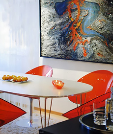
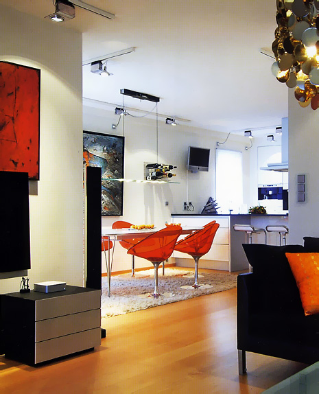
I think it's a very common thing in Scandinavia to show small splashes of color, like, very small. It seems the smaller the color, the bigger the impact (in some cases). My friend, Lone, a Danish girl who lives in New York, showed me an ad (she's a kitchen designer) she was putting in a magazine, and it was a kitchen that was all white with some black and then only half of a red chair was showing, sort of at the way end of the room...of course, an Arne Jacobsen chair. I didn't get it at first, I don't see that a lot, but now, these images brought that concept back to me, and brought it to life. Images from Bolig Liv.

So, now we have 3 interesting elements....white (nearly always), a splash of color, and texture (nearly always). Fantastic combination.

It's fun, cool, and fresh, don't you think? Oh, here's a nice Scandinavian blog, Molly's Heaven and another great one, Lantligt.

 scandinavian kitchens color019.jpg

scandinavian kitchens color020.jpg


scandinavian kitchens color021a.jpgscandinavian kitchens color022a.jpg


scandinavian kitchens color024.jpgscandinavian kitchens color025.jpg

scandinavian kitchens color026.jpg

Scandinavian Kitchens - shades of gray

Scandinavian KitchenI tried to break out of black and white Scandinavian kitchens, but I'll tell you one thing, it's not easy! There is more black than I realized lurking in Scandinavian kitchen designs I am coming across.

Black is very interesting in kitchens...sometimes you hardly know it's there. It is a neutral and it makes a statement, but sometimes it comes on like the strong, yet silent type of statement, sort of like Leonardo DiCaprio...don't you just wonder what's going on behind those eyes (and those eyebrows?) I know I do. Moving on...

Many of us are familiar with a classic light to medium blue gray color, found more in Swedish kitchens than in Danish kitchens, for example. Why gray? Isn't the air cold enough to be also reminded with a cool color? I wonder about that. Doing some quick research does not reveal answers. I'll need to get on this trail. 

The light gray kitchen and dining area is from Vakre Hjem & Interior. The white kitchen, from Interior Magasinet, as well as the top image. The rustic wood and white kitchen, from Bo Bedre.

Enjoy!

 ScandKit 4_16_4.jpg


Scandkit 4_16_5.jpgScandkit 4_16_6.jpg

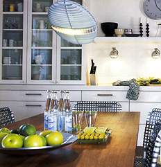
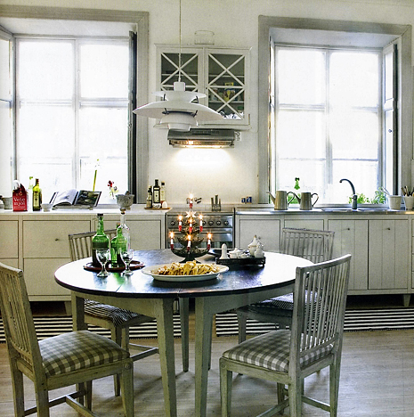
ScandKit 4_16_7.jpg ScandKit 4_16_8.jpg The top light gray kitchen, is very subtly eclectic in style. Notice the lighting fixture above the table. While a classic design, by Poulsen, and designed many decades ago, it is a contemporary feel. The cabinetry, to me, seems a beautifully simplistic country style, yet, with modern overtones, which complement the lighting fixture. The expanse of wall in a singular color, with little ornamentation can also be interpreted in a simplistic modern way as well as simple country. I suppose in the end, we seem to be looking at a modern country look. Do you agree?

Oh, before I go, again, here are some wonderful Scandinavian blogs...I hope the authors will comment on what they see makes their kitchens so special! Take a look at Dreamhouse, a white kitchen in the latest post, and Annas hus pa landet, with a list of blogs to make you procrastinate all afternoon! OK, and one more, Sara vill fara.

Scandinavian Kitchens - Black & White 2

Since last week's black and white Scandinavian kitchens had such interest, I thought I would do it again! You know, I have to admit, something struck me this week that did not strike me last week.

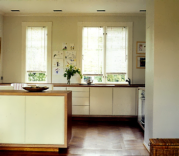
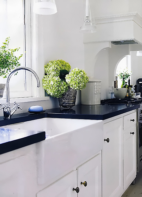
Part of the reason, I think, that these kitchens appeal to us is that it is not just the white cabinetry and great accessories and materials, it is that, surprisingly, and very unlike what is done, at least in the U.S., the walls are also white! The decorative/accessory layer also has much white in it as well. That is what is distinctive about these kitchens and their "look". We see the first image a million times, it is a popular look. But, we do not often see it with that type of lighting or with the simplicity of white walls, or, for that matter, the raw look of flooring such as we have here, which I hope you can see.

As I have said previously, I really believe the Scandinavians do electic "right", and, added to their own distinctive look, with color and light elements, and even the use of restraint, it ends up being stunning kitchen design, and very exciting! The images are from the Danish magazine Bo Bedre, with the bottom right image from the Swedish magazine  Skona Hem.
Good timing, still in the Scandinavian mood, since Saturday, I viewed the Danish movie, nominated this year for Best Foreign Film, "After the Wedding." It was fantastic, please rent it. Oh, and by the way, there are some kitchen scenes in the movie and the kitchen is.....white!
And, as usual, a few great Scandinavian blogs, in which you will see still more kitchens! an angel at my table and  I min vackra varld

Enjoy! 


UPDATE:  Just saw this post on Scandinavian tableware in the new blog Blink Decor...perfect to get a little closer to the look, and it's authentically Scandinavian, Danish to be exact!

 
Scandinavian Kitchens
 

scandinavian kitchens 3041.jpgscandinavian kitchens 3045.jpg


scandinavian kitchens 3043a.jpgscandinavian kitchens 3046.jpg


Scandinavian Kitchens - Black & White

I've previously talked before about Scandinavian kitchens being very light in color, and they often are. White seems to be the common theme. When white, neutral woods, and black, come together, it's very exciting. We'll save color for another day, but these kitchens are no less wonderful without punches of color. Look at these beautiful images from Bo Bedre. Notice the floors, aren't they amazing?

Do you want some inspiration for white or neutral accessories? Look at this amazing blog on Scandinavian design. And, for more inspiration, another Scandinavian home design blog. I will try to feature Scandinavian design blogs every time I do this series, to add the "real" look. I also hope to receive comments and design advice on Scandinavian kitchens from those who live in them!


susan serra scand 2033.jpg


susan serra scand 2031.jpgsusan serra scand 2032.jpg


susan serra scand 2026.jpgsusan serra scand 2030.jpg


Scandinavian Kitchens

I've had a passion, far more than an interest, in Scandinavian kitchen design for many years. It first relates to my strongly held Danish heritage, my parents having left Copenhagen for the U.S., and  me, returning often to visit my family in Denmark, since I was a child. There is a history here. My trips continue periodically.

I have felt for some time that we, in the U.S., are more than ready to embrace the wonderful Scandinavian kitchen and interior design "look". As we move away from a heavier, traditional, point of view in the kitchen toward lighter, simpler, looks, with cleaner lines, the recent interest in Asian design makes sense, and Scandinavian design (far less "known") makes sense to be noticed as well, for reasons anchored in, well, hundreds and hundreds of years past, bringing relevance in a perfect way, to today.

scand kitchen.jpg scand kitchen3.jpg

scand kitchen2.jpg 


 I see several common threads in Scandinavian design, including Scandinavian kitchen design:


  • the broad use of white - as the sun sets so early in the winter months, one needs light! I can tell you that when I was just in Norway in early December, dawn was after 9 am and sunset was at 3 pm, with the sun low in the sky all day, and that was nearly 2 weeks prior to the winter solstice! We walked in town in complete darkness at 3:30 pm. I believe white, or light colors, are nearly a necessity to preserve as much reflected light as possible.
  • the use of color - Scandinavians really love punches of color, whether the color is pastel or bright colors. Often found in contemporary artwork, textiles, and accessories, color plays an important part in keeping away the winter blues.
  • use of natural materials - whether it is light, natural woods, timbers, or other natural materials to remind one of nature and the outdoors. A strong appreciation for texture.
  • clean lines to enlarge small spaces, which most are, in comparison to Americans' generally larger homes. Also, the use of clean lines as part of the Scandinavian design philosophy of an object having beauty in its own simplicity and singular function. A human centered design philosophy. Truly, "form follows function".
  • often, a personal link to the past in regard to beautiful materials and accessories, sometimes encompassing a whole country Scandinavian look of years past.
  • The Scandinavians invented eclectic design! With as much of a strong look to the future, they are masters at combining old, rough, textures with sleek, new surfaces. It is an art to combine the two, and the world must see how the Scandinavians do it so well and so logically. Of course, when you have a kitchen in an 800 year old apartment building with exposed beams and walls, the contrast in new and old materials speak for themselves!
scand kitchen4a.jpg danish kitchena.jpg

I was very excited as I perused the internet on my laptop to see "The Kitchen Designer" site on this great blog, mikkelinesin!  What a surprise! There are some lovely shabby chic, colorful, pieces shown, and the blog is very charming overall with lots of white, natural woods, and color. Another good Scandinavian blog is Guldkant Pa Livet with beautiful images of a lovely Scandinavian lifestyle.

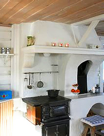
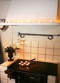
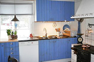
The top three images come from this blog. The top blue kitchen is the blog author's own kitchen. The house is from 1750 and the oven is probably from the same period. The white oven image is from the north of Sweden and dates from 1890. The middle lighter blue kitchen images come from the Kvanum kitchen company.

This is but a very small sampling of Scandinavian kitchens I will be showing you. Every Monday will now be "Scandinavian Kitchens Monday"! Don't miss it. I would love for those who live in Scandinavian countries to talk more about what makes their kitchens wonderful. Please add more information to enlighten us all!

Just to put this over the top, please visit this blog, Red House, authored by a Swedish designer living in the U.S. You can get lost in all the wonderful images.  

Scandinavian Kitchens? You heard it here first. 

The beautiful image below is from the Norway's beautiful interior design magazine, Bonytt. Enjoy!

Scand kitchens 1001.jpg