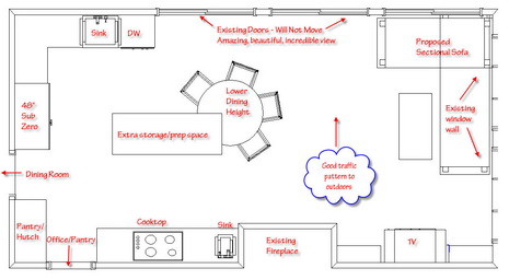
Is the kitchen triangle all it's cracked up to be? Well, YES, for the most part. But, today's news in kitchen design is that the kitchen triangle just may not be for everyone! And, the funny thing is, I do believe that my presenting a kitchen plan to a client which does not include the kitchen triangle allows the client to be more savvy and confident in regard to what they want from their kitchen, not less.
In this situation, I gave my clients a wide variety of very different plans which were good possibilities for their space. There is never just one solution, oh no! Some plans had angled islands and peninsulas, including other design solutions, and, appliances in varied positions.
Long story short, this was the one they chose. Why? For two reasons. First, they both cook. Right now, their aisles between obstacles, all around the kitchen, range from about 24" (that's correct) to 39" in width. Incredibly tight, with no room to move around. Frustrating to say the least. No doorways or windows could be moved.
Second, they have frequent visits from their grown kids and their families, and they love to entertain. When they entertain, whether for family/casual purposes or other guests, they wanted to have an area where they could set food down in buffet style. This was one driving force for the plan they chose. I reminded them that this seemed to be their focus, to make sure this was the path that was right for them.
When I mentioned that the trade off of this plan is the island's position as an obstacle between the clean up sink and the cooking area, (what a great cooking area it can be) this was not a concern, a trade off that many others could not live with, but, to these clients, is seen more as an advantage than a disadvantage.
Next week, I will give them options for the clean up sink to be on the other wall, switching the refrigerator to be near the sliding doors. Why? Perhaps the sink going on the adjacent wall will bring us more interesting design opportunities for that wall, and send the monolithic refrigerator to where it is less obtrusive. Put the refrigerator where the pantry/storage is? No, the door swing does not work at all that way.
The plan also allows for good passage to the outdoors, and as my client mentioned, the ability to turn the table chairs around for more seating at the seating end of the room. Designing three areas into one means that the client needs to consider which areas get the emphasis...the kitchen, dining area, or lounging area. This is the critical piece. The answer is different for everyone, there is no right or wrong. Drawing plans in a simple way, such as this, enables my clients to focus just on countertops/storage, appliance locations and traffic flow. Now, the blanks can begin to be filled in.
You CAN break out of the kitchen triangle. I promise the kitchen police will NOT track you down! And, if they do, call me, I'll bail you out!


