How To Design A Kitchen - And Google+

One day I was inspired to talk about how I approach the design of a kitchen and I described the process on Google+. I put lots of good, fresh, content on kitchen design in Google+ - some which is in short snippets and some long form. From time to time I will share that content. You can find me on Google+ in three places:

And that's not all!!! I have created my own personal hashtag on Google+ called #SSKITCHENTIPS which puts ONLY my personal kitchen content in one place, not mixed with others' content and not mixed with my NON-kitchen content. It's all there, so follow me on Google+ as well and visit me in these places in addition to the blog. 

Here's a little bit about my philosophy on how I approach kitchen design. If you're on Google+, please comment on that post as well right from this page!


If the post does not appear above this line, you can find it here

A Dysfunctional Kitchen

This could be the most fabulously dysfunctional kitchen design that I have laid eyes on in recent memory - what a great find from my tumblr feed!

It's everything fabulous - the uber-serious moody overtones, the sense of haute kitchen fashion, the "this is my kitchen and did you notice the old iron lally column???" nuance. But, the best feature is the utter and ridiculous dysfunction.

First question - who in their right mind would actually spend the money to execute this "design"? It has to have been designed for some sort of set. I do see a table off to the left of the image - could this be a real home? Speaking of fabulous, here is a list of the fabulously dysfunctional elements to this kitchen design:
  • Note the high sink edges and the faucet controls
  • Where is the storage?
  • See the location of the refrigerator-behind the sink
  • Doesn't look to be much lighting
  • How does the antique brass countertop hold up?
  • How do you clean this kitchen?
  • What is the significance of 6 pans on top of one another on a gas burner?
  • A recirculating island type fan = ZERO FUNCTION
  • Where are the dishes and glasses, not to mention food, stored?
If this set was not designed specifically to torture a professional kitchen designer, I'm not sure what other purpose it serves! 


To me, this image does provide one interesting lesson: Don't immediately be influenced by what appears to be esoteric, fashionably-original design, as being representative of GOOD design. Money thrown at high end products and materials (and designers) does not necessarily translate to good design. My work is done here ;) 

The Modern Kitchen Pantry

The design of the kitchen pantry is an opportunity to play with form and function. The image below was taken by me at a kitchen fair in Germany, LivingKitchen. Take a look at the special design elements.

Finish - An immediate attraction for me, this super rich brown finish adds a large dose of immediate visual warmth regardless of its otherwise modern design. The grain has a horizontal direction, another hint of a modern aesthetic.

Cubicles - We quickly focus in on the three white cubicles, situated in the cabinetry in an asymmetrical design. The cubicles serve to project an unexpected visual treat, solely to add interest to the cabinetry. The high contrast of bright white surrounded by the rich brown finish serves as a visual punctuation mark!

Recessed Hardware - The hardware, recessed rather than a separate pull or knob, provides a built-in look and a modern horizontal shape. 

Lines - The rectilinear shape of the pantry cabinetry, unadorned by molding, accentuate its modern design.

Overall, these pantry cabinets communicate a look of modern sophistication. Think out of the (typical) pantry box to add your own special design elements. It's rewarding to just take a few creative steps beyond the typical which always results in a highly personal and timeless design.


New Kitchen Ideas That Work - Book Review

New kitchen Ideas That Work, by Jamie Gold is, simply, a good book, a great reference, and a source of inspiration for the entire kitchen design process. Upfront, I've got to say that I heartily endorse this book as a go-to manual for homeowners to get those "kitchen ducks" in a row before you spend your first (or second, first being this book) dime on your kitchen.


As I've said before on this blog, I've lost a friendship over choosing not to review a book on kitchen design due to its errors and overall sub-par quality and have declined to review another book by an author I did not know for the same reason. Thus, I take the subject matter very seriously, being a certified kitchen designer for many years. 

I know the author of New Kitchen Ideas That Work, Jamie Gold, quite well. We have been friends and colleagues for a number of years. Of course, I must also mention that images of one of MY kitchens is in this book. That's all well and good, but still, if this book did not meet my standards, overall, for kitchen design information, I would absolutely pass on doing a review. And, as noted above, my knowing the author has no influence on my decision to review this book.


Review Notes

I love the way the chapters are organized. The topics have a progression which makes perfect sense within he framework of a kitchen project and makes it easy to understand the process and to find the information you need. The tone of the text is conversational and the content is easy to understand, making it read almost like a novel - it's actually a pleasant read! You feel as if you are being spoken to by a trusted design professional whom you have known a long time and have a lovely rapport with. 

The reader is not being told to replace everything, but to pick and choose - wisely, with recommendations: choose a facelift or complete remodel which, of course, also relates to budget issues. Jamie walks you through this decision making process and many others throughout the book.

Islands, work zones, appliances, layout, storage must all be considered together, at once, in the preliminary design process. Jamie addresses each of these issues in depth, making sure the homeowner asks himself/herself the right questions to get to the essence of the appropriate design solutions for his/her/their individual lifestyle needs. Let me tell you - these are big issues as most people only do a kitchen once! 

There is a wealth of design information covering styles and themes of kitchens as well as how individual materials nudge the design in one direction or another. In addition, the properties of many materials are discussed including durability, cleaning, preparation and specialized installation requirements. Jamie goes beyond noting the most common materials used in kitchens and notes materials that you may not have heard of.

Decorative details - a decorative "layer" that I have always said must be considered at the start of the design process, are discussed. Beautiful images are seen throughout the book providing information and inspiration. In fact, I would definitely say that this book has equal parts of each - information and beautiful visual inspiration.

There is so much more good content that I do not have room to mention in this post. Sinks, faucets, lighting, backsplashes, the role of technology in kitchens and more, more, more. Your money will be well spent with and is a smart initial investment toward your new kitchen project.

How To Design A Kitchen - Kelly's Kitchen Renovation

The design of a kitchen is not just about choosing where to place cabinetry and appliances and then filling in the blanks. Actually, there are many, homeowners and pros alike, who attempt to make the design of a kitchen a simple affair in favor of speed to quickly move forward on the project. But, it shouldn't be that way. 

This was Kelly's existing kitchen. The floorboards are approx 6" wide, so you can tell the space between the table and the cabinetry and entrances is small! It simply has no focus or interest; a case of "fill in the blanks."When I design a kitchen, I don't plan around any one element first, such as cabinetry, appliances, countertop space, other storage, windows, dining area or traffic flow, allowing one single element to drive the rest. Each of these elements mentioned are not only important, but critical to consider nearly equally with one another. What that means is that all elements must be considered at the same time! Really!

So, it becomes an exercise in: "if this, then that" over and over again. That's where the vision comes in - to quickly and frequently look at the "big picture" in different ways and evaluate it objectively. I love the initial chaos of it all! You're actually in limbo for a little while. It starts by my doing a number of floorplans for comparison purposes. Autokitchen renderings brought the kitchen to life throughout the process. Don't miss many universal tips in the solutions entries below - that's where the answers lie!

This is the final plan chosen among about 5, and the orientation is the same as the image above. The door is removed (another exterior door is a few steps away from the kitchen at left but down another few steps to the outside), the short wall serves as a divider and the dining area is expanded..among other changes! The shallow leg adjacent to the sink wall was designed into the new floorplan-it was not existing.

This approach becomes more intense when I am designing a small kitchen, such as Kelly's. There is no room for error! Following is my thought process on designing Kelly's kitchen, just below. You will see that some solutions are repetitive - that's because some solutions killed two birds with one stone (what a saying!) 

  • Storage: Kelly would kill me if she ended up with less storage (and she kept asking me if she would) so storage played a big role. However, the boring, unattractive upper wall cabinets and base cabinets were visually intrusive and too "kitcheny" not to mention depressing so those had to go. Somehow storage had to be equally beautiful and ample AND far less intrusive to the eye.
  • Solution: I designed a pantry into the plan, I encouraged Kelly to evaluate what she really needed in her existing cabinetry, we utilized a very cool backsplash rail system for utensils, and I designed ample drawer storage for serveware and cookware into the floorplan. Cabinetry was dramatically reconfigured AND beautiful!
  • Entertaining: There is no dining room, so the kitchen MUST seriously double as an entertaining area.
  • Solution: I found room for a big, bold, dining area with a banquette on two sides, offering flexible seating and the ability to extend the table and put a chair at the open end if necessary, accommodating 8-10 people, seated. Too often, I have seen dining areas be an after thought in kitchen designs. This dining area was a critical piece to the floorplan.


  • Selecting Appliances: The existing refrigerator was 30" wide, much too small to suit their needs. The dishwasher was beyond repair, the range was very worn and stuck out like a sore thumb and the hood was a sorry excuse of a hood!
  • Solution: Bosch appliances filled every need for this kitchen redesign. We chose a 36" Bosch refrigerator with lots of great features. I recommended Bosch's safe, powerful, and efficient induction cooktop and a Bosch convection oven that would be built below the countertop for a sleek look. The Bosch dishwasher is a workhorse with a convenient top tray for utensils and is one of the only dishwashers that can accommodate a tall toekick that we needed for our cabinetry. I wanted to make a design statement by using a moderately priced and sized Bosch hood, which we outfitted with a tall black chimney pipe for a cool look. Kelly will discuss the performance of these appliances soon!
  • Sink/Faucet: Kelly wished for a large sink and we found a wonderful modern style cast iron sink by Kohler, the Indio. The color is sophisticated, it blends beautifully with the countertop and has a cutting board as an accessory which adds to the prep space. The Kohler Karbon faucet is sculptural in its design and functions beautifully. These choices were critical to the look of the kitchen...we wanted the sink to be understated, the faucet to have an artistic quality to it and we needed both to be high performance.
  • Countertop Space: Kelly is an avid cook, so counter space was important!
  • Solution: I designed the countertop, by Silestone, to have as few every day items on it as possible, freeing up most all of the counter space for prep. We wanted the countertop to blend with the sink, again, as an understated design element, working beautifully with the cabinetry. Part of that design was to use a useful and beautiful rail system by Kessebohmer
  • Small Appliances: Small appliances needed a home - in any kitchen, they creep on to the countertop and before you know it, you end up having very small, shallow pieces of prep space. I vowed this would not happen in the new kitchen - but how?
  • Solution: A new shallow "leg" was planned to be an "L" off of the sink wall solely to house small appliances. All cabinet L-shaped turns do not have to be 24" deep! Kelly also wanted a spot for the waste bin that she loved (true!) so I included that in a featured area of that section for a hip, useful, look. I didn't see the need to persuade her to rethink where to put the trash.
  • Traffic Flow: Existing traffic flow was simply horrible and needed to be changed. The door and table location in the existing kitchen made a sort of maze which was difficult to move around. The area around the table was cramped and cooking/prep traffic was inefficient.
  • Solution: I offered several plans, some with a more open traffic flow than others. Kelly chose the one with the most freedom of movement in the kitchen work area. I quickly thought it would be a good idea to put the table 90 degrees in the other direction, design in a smaller table than the existing oversized table, use a banquette for added space and expected that it would improve the traffic flow times a million! It did.

  • Seating needed to be mega maximized since there is no other dining space in the home and they like to entertain friends and family, not to mention the needs of 2 growing kids who are constantly on the move.
  • Solution: Nearly right away, I thought the table should be turned 90 degrees from its existing position. Most of my plans included a round table in the corner, also with a long L-shaped banquette, but we later decided on a rectangular table. The banquette offers lots of freedom in seating for kids and adults.
  • Non Cooking Activities: Kelly sews and does all kinds of projects with the kids, so there needed to be comfortable and adequate accommodations for project work.
  • Solution: A good sized table and a big, flexible banquette allow for good flexibility for seating and working. The kitchen is not only about storage and appliances! It's about lifestyle needs!
  • Windows: The lack of windows made the space seem smaller and the small windows that were in the kitchen did not look or perform well.
  • Solution: A quick, early thought of mine was to add large windows to visually expand the look and feel of the entire kitchen, allow those dining to enjoy the lovely view beyond and create a dining space with a more open feeling, in part, so one didn't feel so connected to the "work space" of the kitchen. The window at the sink area goes right down to the countertop!
  • Aesthetics: Aesthetics had to be on EQUAL footing with a functional floorplan in order to have a comfortable, visually interesting and spacious feeling kitchen.
  • Solution: To gain a spacious feeling we used lots of white (including refinishing the floors in a very light finish), large windows, strong horizontal lines, expansive surfaces of tight or small patterned materials and designed a floorplan for freedom of movement. The cabinetry reads as furniture, creating a seamless transition from the living area beyond. Functionally, we positioned open shelves with useful items far away from the dining area to not be obtrusive, found a home for small appliances to enhance the countertop use around the kitchen, added a pantry and used drawers and interior roll out accessories for efficiency. The dining wall, painted dark gray, evokes a more elegant and separate feeling in the dining area. We incorporated shelving for useful items and to create changing decorative displays of artwork and objects.

  • Lighting: The light fixtures in the ceiling did not work aesthetically and there was no accent lighting or task lighting in the existing kitchen.
  • Solution:  We relocated a ceiling fixture, did much reswitching and added lots and lots of task lighting and accent lighting which completely transformed the kitchen into a living environment which can accommodate many focused lifestyle uses and moods. We used Hafele products, which are state of the art in aesthetics and function. More on lighting soon!


The "Wall": The short wall to the left of the existing sink wall turned out to be in the perfect position in the new kitchen plan as a dividing wall for the dining space.

We tried hard to work within the existing footprint. While a variety of about 6 or 7 plans were provided by me to Kelly and Dave, in the end, there was not a compelling reason to move the sink. We moved the refrigerator and cooktop a little bit, but that was easy to do. Their desire was to keep labor costs low and work with what they had. 

Could you honestly pick one of these items above and say it should be the driver of the design? Not in my world - they are all important pieces to the design puzzle, all very nearly equally important! It is important as first mentioned, to be able to quickly analyze: if something is changed, what is the pro or con and what does it effect next? The reason this post is so long is because there are so many issues in any kitchen design to tackle, and I bet I'm forgetting a couple more!


Thank you to partners: Kohler, Silestone, Bosch, Hafele, Kessebohmer, autokitchen and Kravet who donated products or services and who had the vision to know this renovation would use their products in interesting and creative ways!

Kelly's New Kitchen - It's Personal, Smart, and Flexible

Kelly's kitchen (see Kelly's picture on the right sidebar and wave!) was just finished a couple of months ago after a year of planning and 2 months of renovation! While our images quickly show the overall design of the kitchen, there are MANY features, both aesthetic and functional, that bear dissecting and sharing with our readers. 

Design is often the art of nuance, and this kitchen is all about nuance!! You'll see how soon - this is the start of our series! In each post, we will provide important tips, insight on how a designer thinks, the collaborative process and product information.

When you design a small kitchen, in this case, close to 200 sq ft, (small for the suburbs, huge for Manhattan-and we have (separate) personal living experience in no less than 6 Manhattan kitchens) every decision, no matter how small, is critical! With no additional dining space in the home and needing to accommodate a wide range of activities, it's a design that is either pass or fail once kitchen living begins post-renovation.

Kelly's new kitchen reflects the choices and compromises of real life needs and desires of a young family in their first home. It's a mix of DIY, designing around architectural elements we chose to keep in place and others that we chose to remove and replace. It's about designing with the end always in sight, including the surprisingly important decorative layer.

The kitchen (as many do) needed to serve these purposes:

  • A social kitchen - comfortable to be in for long periods of time
  • Able to accommodate as many people as reasonably possible
  • Appear as spacious as possible while balancing storage needs
  • Allow for a decorative layer including "real" artwork and treasured artifacts
  • Capable of change, which we will talk about in depth later, possibly the most exciting aspect of this kitchen renovation
  • To add an enhanced dimension of efficiency and function to the cooking process
  • Accommodate multi-functional activities (more about that later)
  • Reflect a highly personal design aesthetic overall

We are fortunate to have wonderful partners who donated their products and who had the foresight to see that this kitchen design would provide intelligent and interesting solutions to common design issues. We're proud of how it all came together, and as mother and daughter, we didn't even have a whole lot of drama during the process! Ok, we each took turns with some creative techniques of persuasion...true enough! I may or may not have coached Kelly on how to present controversial design ideas to her husband, a "trust but verify" kind of guy. ;)

So, thank you to our partners:

Next up, Kelly talks appliances - what was selected and why, where they should be best positioned, features, design integration, and more. Here's our nuclear family-the only one missing is baby Annabelle.

Cultivate.com Renovation Diaries - Kelly's Kitchen Remodel

Kelly and I are extremely excited to announce the start of a series in Cultivate's Renovation Diaries on Kelly's kitchen remodel which starts today!

We are, right now, in the thick of the remodeling process with (literal and emotional) sparks flying, changing decisions, agonizing over details, declaring the progress GOOD (sometimes after a change or three) and all that goes along with a remodel of the heart and soul of a home executed by a bunch of hearts bound together as a family.

Join us for this five-part series on Cultivate, coming to you on each of the next five Mondays, beginning today.

I'm not controlling. Just because we had this email exchange about our Cultivate portrait:

On Thu, Sep 27, 2012 at 8:13 AM, Kelly Serra Donovan <Kelly's email address> wrote:

other way around!

On Thu, Sep 27, 2012 at 7:53 AM, Susan Serra <susan's email address> wrote:

We could do a funny pic of me inside the house and you peeking through the window...just a thought!

It has no bearing on my thought process - really! ;)

We would like to acknowledge the generosity of our partners - Bosch, Silestone, Kohler, Hafele, Kravet and Kessebohmer who shared our vision by donating products to create a "different" type of kitchen that, with smart product choices and an innovative floor plan, would provide inspiration to others to make your kitchen "your own." Cabinetry is by our brand, Bornholm Kitchen and the kitchen will feature beautiful accessories from Scandinavian Made as well as from Kelly's personal collection.

The first five posts as well as the big reveal will be seen on Cultivate, and after that series is over, end October/early November, we will have much more to talk about on this remodeling journey right here!

A French Kitchen Renovation

Some time ago I corresponded with an American living in France who was about to undergo a kitchen renovation in their 200 year old home in a small French village. We talked about working together and for various logistical reasons in connection to the renovation work, it didn't work out (trust me, my bags could have easily been packed in short order!) 

I was so pleased to receive an email yesterday (months after our conversations) with images of the home with its bones exposed...and intact! The home is small. The first floor is 220 square feet and will serve as the kitchen which also features a wood burning fireplace. I am told that the front interior wall will be exposed stone. The homeowner says, "The floor under linoleum is original terracotta tile." Original.Terracotta.Wow!

They will be installing traditional French kitchen cabinetry, made by a local shop called Muebles Baluteau - just look at the beautiful cabinetry in the website. I feel like I've stepped into a French fantasy when I look at some of these pieces.

The whole point is, I wanted to share these cool images with you. Normally, when a house is gutted in the states, we see wood studs, pieces of sheetrock and a plywood subfloor. This gutted space is a beautiful sight to behold!

Below, pretty crazy construction with hand hewn timbers:

Below, a lovely combination of original materials - stone, terracotta, hand hewn beams, a simple and elegant fireplace, and beautiful, narrow brick. 

Below, another view of stone, a staircase and large, hand hewn beams:

Below, more beautiful, original and authentic surfaces

Below, once again - fantastic, preserved, materials

What a privilege to take a look at the exposed interior of this home. I hope to share more images with you as the renovation progresses! 

Modern-Aire Ventilating

I know of Modern-Aire Ventilating for many, many years. I know it as a bit of an under-the-radar resource for ventilation products, usually specified by professional kitchen designers. I know Modern-Aire to be highly reliable, super flexible as to what they are willing to do for their design professional clients in terms of customizations and they are also a manufacturer of high quality products. It pretty much says it all.

Modern-Aire has their own collection of, let's say, standard hood sizes and designs as well as a broad/standard palette of colors. That is only the beginning, however. Take one of their standard hoods and design it any which way, and/or make it Sky Blue Pink and the folks at Modern-Aire are all zen-like about it - it's your world. 

Don't care for the standard hoods? Design your own. Reinvent the wheel. It's all good.

I always firmly believe that the culture of a company, good, bad, or indifferent, is reflected by philosophies and attitudes of those at the top. I have had the pleasure of getting to know a few of the people who run Modern-Aire and they're all zen-like too - in the best of ways....pleasant, happy, enthusiastic people, passionate about their products. Can you be zen and passionate simultaneously? Yes!

But, wait, that's not all!! Designers like flexibility. I had a plan for the Bornholm Kitchen display at the Sag Harbor showroom of Kitchen Designs by Ken Kelly to design an interior ventilating system that would be a) short in height b) powerful and c) able to have its duct directed straight back rather than vertical in order to allow for a completely open space above the short, horizontal, hood. 

I brought my problem to Trevor Lawson at Eurostoves and he came back to me with the solution - problem solved. Sometimes a design will call for an understated, yet powerful, ventilation solution. There are precious few companies who will reinvent the wheel 7 days a week, but Modern-Aire does that. 

Trevor has special programs and benefits for designers and other trade professionals who specify Modern-Aire. Service is one of those benefits. You can't rattle Trevor, he is a sea of calm, and he is a wealth of information. As a designer, I know Modern-Aire will do what they can to figure out how to give me what I'm looking for. So many companies default to "no.....because...." and that's why this is all so glowing - Modern-Aire does not do that unless physics tell them otherwise. So, then, what we have is design flexibility, high end quality and superb function. Simple.

Kitchen Design Consulting

I've just opened up my schedule to do kitchen design consulting for homeowners who need smart solutions for tough kitchen design issues.

I have offered this service before and have helped many homeowners work through important design, construction, product issues and more.

To avoid mistakes, design errors or just to get that second opinion to help work through a project that you may only do once or twice in your life, is certainly invaluable. Taking this step makes good sense in the "big picture" of your project.

I've purposely reduced my workload in a few significant ways, so I have a little room in my schedule to add this service back into my design practice and help you work things out. Being able to get back to meeting and helping so many nice people came right to mind!

Go to this page on kitchen design consulting and you will see what to do next.

I look forward to hearing about your project. Smart solutions, flexible problem-solving based on solid real life experience and a heartfelt interest in doing what I can do to help will point the way forward.

-Susan


Kitchen Backsplash Height

The height of the backsplash, the space between the countertop and the bottom of the wall cabinets, is often left as an afterthought by many kitchen designers and homeowners. It's rare in my experience that the client expresses an opinion about the backsplash height. However, If the height of the backsplash is not considered carefully, comfort and function could very well be at risk and affect one's lifestyle in the kitchen - for a very long time.

Below, a backsplash height calculated for a variety of issues: a concealed microwave, height of the client, function and display.

Just this morning, I received a question from a fellow kitchen designer. I wrote back an answer and realized that the answer was good information for a blog post. 

Hi Susan,

In discussions with my design team I am questioning the distance between the counter top and the bottom of the wall cabinets.  Two of my designers, who have over 75 + years of experience feel strongly that “custom design” should be a distance of 15” to maybe 16.5” 

I, on the other hand , being 6’3” tall feel that anything less than 18” (or with a molding applied to hide lighting) 17.5” is too tight a space.  I’m not asking for a definitive answer, but I thought with all of your travels and experience in the marketplace you might be kind enough to share your design thoughts with me about this.

I wish you and yours a very safe and enjoyable Holiday Season, and I very much enjoy reading your blog. Thank you for your time.

My answer:

Sure, I'm very happy to weigh in on this issue. However, you answered your own question! Where possible, which is nearly always the case, one should attempt to customize the height of the backsplash depending on the height of the homeowners and/or primary chef/bottle washer. It's a nuance, actually.

Below, calculations based on multiple criteria as above: client height, storage needs, display.

Two tall homeowners? Increase the height.

Two short homeowners? Shorten the height but beware of countertop appliance heights since that must be dealt with.

Two homeowners, one short/one tall, both helping out? That's a negotiation that might take a little more time and is a personal decision between the homeowners. In that case, the proposed/negotiated backsplash height really must be mocked up so each can experience the height and decide what works and what does not work.

Perhaps, then, tall pantry storage can come into play where access is more "democratic." Or, one area may have a lower backsplash and another could have a higher backsplash if designed to make sense visually. A countertop wall cabinet will help too.

The other issue, of course, is if trim is added below the wall cabinets, potentially shrinking an already short backsplash or not allowing countertop appliances to fit.

Then, you have children. Do the homeowners wish children to take an active role in the work within the kitchen? If so, storage should be planned to be at lower levels via base cabinets (dish drawers) or a pantry with better access.

Below: Kitchen of Cynthia Bogart, editor of The Daily Basics

I'm always compelled to note that there is a 15+" wide cabinet to the left of the range :)

For my clients of typical height, I usually opted for a 17" backsplash and ran it past them to verify that worked for their lifestyle and did not interfere with countertop appliances. I was taught way back that the average backsplash height could be from 15-18". That, however, is like saying "I'd like a brown stained cabinet" ... it's only a starting point.

I hope that helps!!
Regards, 
Susan

What I did not add into this note (and should have) was the issue of physical abilities of the homeowners. Having a family member (in my own home) whose reach and bending ability has changed dramatically, the physical ability of family members is a critical question to ask as well.

::Surroundings:: Guide to Decorative Living Kitchens Feature

Nearly under the wire in bringing you the latest issue of the Surroundings online magazine for May/June on my favorite topic, kitchens, Linda Merrill brings us some great kitchen design information in this issue.

If you don’t know Linda, I’d go so far as to say that she is one of THE hardest working, and most innovative, design bloggers. Linda not only writes the blogs: SurroundingsSilver Screen Surroundings, and Master of Your Domain, she also hosts The Skirted Roundtable and publishes her ::Surroundings:: Guide to Decorative Living digital online shelter magazine every other month. I thought I was hard working! 

Bornholm Kitchen 4In this issue, I am truly honored to be featured in Linda’s digital shelter magazine. Linda has featured me in an extensive interview and we talked abut my new collection, Bornholm Kitchen. There is no doubt that it is most gratifying to get the respect of my peers. With that as a foundation for this new product introduction (and a barometer), I feel confident about the future. Thank you Linda for this lovely feature.

I also like Linda's feature on "Appliances That Designers Love" and who doesn't love to look at Kitchen Bling, another feature in this issue? Linda does her research and does it well.

Take a look at Linda’s digital magazine and follow her in her various venues online. You will learn something – she’s a thinker on all things design focused.

Kelly's Kitchen Sync - The Book!

Kelly Morisseau, CMKBD, author of Kelly's Kitchen Sync, just released, has been a great friend, colleague and fellow blogger for many years. Kelly's new book provides a wealth of practical information and tips on all those pesky little details which make ALL the difference in a kitchen design that works for the way you live, both aesthetically and functionally, for perhaps, the next few decades or so.

I have reviewed a few books before. In one case, a long term professional relationship completely dissolved forevermore because my colleague's book on kitchen design, sent to me for review, was so far below my standard for useful (and current) information, that I felt that I could not and would not endorse it (there is no way to say that gently to a colleague, trust me on that). My memory fades on another two books that I also could not endorse, but one refusal was due to flat out inaccuracies that I easily uncovered. Point? My professional standards for information relating to the kitchen and bath industry and design process are VERY high and no, friendship does not trump endorsing what I might consider to be sub par information on kitchen design released to the public at large. I'm a bit wound tight like a lionness in that regard for some very strange reason. I know...I probably need to fix a margharita and relax. 

"Kelly's Kitchen Sync" is a good book. It's the real deal by a smart and experienced (key word) certified kitchen designer, and it offers solid information that is important to know as one navigates the universe of designing a kitchen. The information in Kelly Morisseau's book can truly enhance one's investment in one's home, often the biggest investment one makes, not to mention enhancing one's lifestyle in the kitchen.

Following are nuggets of information (every page offers valuable gold nuggets) that are not only good to know but will add a layer of detail that makes all the difference in the design process, resulting in a kitchen with a higher level of aesthetics and function, especially if one tackles the kitchen design without a professional kitchen designer (no one does that, right?) Following are snippets of good information!

"Clear as glass", page 97:

Kelly talks about mullions on glass wall cabinet doors intersecting with shelves and offers solutions to work around what can be a collision of lines which would otherwise most likely not have been noticed till...later. Four pages on glass shelves and glass doors? Impressive.

Here's just one insider tip on hardware...so simple, yet proportion and scale is the foundation behind this simple, but important, advice.

"Which is better, knob or pull, page 102:

Before you buy, check the width of both your smallest and widest drawers. Buy a few sizes and see what looks best. If your cabinet is 27" wide and the handles are 4" or less, I sometimes recommend using 2 handles, spaced 3"-5" from each side of the drawer."

 Ah yes...the insider's tips for ordering cabinetry correctly...

"Order up! The top 11 beginner mistakes of cabinetry orders (and how to avoid them)", page 81:

(One of my favorites) - "Tall cabinets, such as a 96" high x 24" deep cabinet, will NOT tilt upright in a 96" high room. It's a simple law of physics - the corner of the cabinet will strike the ceiling first."

Perhaps you get the idea - endless tips are provided throughout the book to help, yes, avoid disaster! An experienced kitchen designer has multiple solutions at the ready for nearly every situation that arises. Here, Kelly has laid the foundation for one to understand not only what those solutions are, but WHY these issues are important to know. And, she explains them in an easy going manner that is both entertaining and informative. Kelly's Kitchen Sync - the book!


Martha Stewart's Morning Living Program - 10 Tips To A Great Kitchen Design

Well, we covered a lot of territory in the chat on kitchens with Brian Kelsey (Kelsey On The House) host of Martha Stewart's Morning Living radio show on SiriusXM in which I was the guest. I know, since Brian is a lover of all things "home improvement" we could have kept the conversation going for a long time!

Here is a wrap up of ten tips for a great kitchen design:

1. How long will you be in your home? The answer to this question will guide you toward budget, style and issues of function. If you will be in your home less than 5 years - think in terms of resale and be conservative in your selections. Longer than 5 years, put more of "yourself" into the kitchen design to create a kitchen that works for you.

2. Speaking of personal design, that is surely where we are headed in recent years. Do the hard work up front to determine what is a habit and what is something you really desire in the kitchen. For example - do you want the dishwasher on the adjacent wall of kitchen because you are used to it or because you really like to use it in that position? Beware of kneejerk reactions - think carefully!

3. What is timeless? I think it is safe to say that classic wood species such as cherry, maple, and other, somewhat "quiet" grained woods in brown stained finishes are truly timeless, as they communicate a classic furniture quality. Whites as well are classic for kitchen cabinetry - who doesn't love a white kitchen?

4. How to get value? Value is received, as above, in a timeless design, in timeless products and components, in quality products which will last over time. It is a sustainable way of thinking as well.

5. What are cool products? Having been to many design shows, I can tell you that sinks with glass worktop covers to conceal the sink from an open kitchen are hot! Hardware in warm finishes and hardware that is more bulky in nature (more bang for the buck) works well in today's kitchens, and of course, hardware is the jewelry of the kitchen! A warm/modern look for the kitchen is what many people are thinking about now.

6. Appliances! Appliances are becoming increasingly concealed as the kitchen floorplan is becoming more open to surrounding rooms. Even ovens are being seen behind closed doors. Panels on appliances do the trick to disguise the function behind the cabinetry facade.

7. Social Network - The kitchen is the social hub of the house and we are seeing larger, multifunctional islands being designed into the kitchen. Easy to communicate with others and great for assisting the chef or a spot to use for entertaining purposes such as arranging wine and wine glasses on one end, islands serve endless social functions. 

8. Where to start? With so many activities happening in our kitchens, write a list of all the activities you see going on in your kitchen. What is your lifestyle? How much importance and use will certain activities take on in the kitchen? Be realistic about your lifestyle and a functional kitchen design will follow!

9. Healthy Kitchen Design - Appliances today have healthy features! Grills, steamers, steam cooking in ovens, rotisseries, filtered water in our taps, fresher refrigerator storage, induction cooking - these are some examples of how appliances can truly work to produce and enhance a more healthy lifestyle.

10. Take your time! The kitchen was not built in a day! The more time you can shed old habits and hone in on what is really important to your family "now", the better your kitchen will be aligned to the real "you." 

Below, a preliminary floorplan for an open kitchen. Cozy, social, ahhhhh!

KBIS 2011 Kitchens

I always like to walk the kitchen and bath show and take pictures of the kitchen displays. Having just been at IMM Cologne in January, the kitchen designs were dramatically different at KBIS and I MUST gather together the images I have of full size kitchen displays from the IMM Cologne show.

There is much more detail in the KBIS kitchens (that is not a positive or negative, it's in the eye of the beholder.) The first image is from an Italian manufacturer and all others are American manufacturers - the style contrast is clear!

My opinion: in some cases, more is not better. Restraint is a good thing...less is more and all that. We also need to remember that we will have reactions to these different styles and there is a kitchen design for everyone, just like there is a guy for every girl and vice versa. Enjoy!


Get the flash player here: http://www.adobe.com/flashplayer


Autokitchen 10 - Amazing Graphics, Smart Design

As gushed noted previously in this blog, I have been, and remain, captivated by the visual poetry of, yes, the graphics of Autokitchen! (Going to KBIS? Autokitchen will be at booth C4990.)

Some time ago, my eye and my brain got married to Autokitchen. The brain put it this way: “This program is relatively easy to learn, is fast, and has every part and piece I need to create as simple or as custom a kitchen as I need without skipping a beat.” The eye felt this way: “The graphics are simply to DIE for!” A happy marriage (cue the white picket fence).

Enter the next generation, Autokitchen 10 (do you love this analogy so far?) The next generation often has it better than the previous generation and this is no exception. Here are some of the attributes of Autokitchen 10:

A new mosaic collection from New Ravenna (stunning tile)

Several new collections of wood carvings including Art for Every Day, Classic Designs by Matthew Burak and Adams Wood Products

New architectural tools to create even more professional architectural drawings, including new, impressive, dimension styles

Many new appliances, door styles and countertop materials

This week Autokitchen is releasing the catalogs for Wood Mode /Brookhaven and allmilmo – that’s big!

These are strong new additions to Autokitchen, already the leader in high quality kitchen design software. The color graphics of the program are outstanding. Floorplans, elevations, and perspective drawings are detailed, with a crisp, architectural look.

On a personal note, I tell my children more than they want to hear that a secret to life is to think flexibly. Autokitchen thinks so too - it allows a designer to go with the flow with enormous flexibility to modify cabinetry on the fly and/or to draw and extrude shapes into 3d objects FAST. It's reliable and the technical support, from my own personal experience, is a notch above top notch, maybe two; you will receive superb and friendly service.

Two versions of the Autokitchen Studio version begin at $995 and software prices are on the website; affordable and price transparent. 

What I am REALLY excited about is my forthcoming affiliation with Autokitchen and my new collection, Bornholm Kitchen. Our partnership will allow Bornholm Kitchen designs to be brought to life as only Autokitchen can do. Soon, I will give you a few sneak peeks of our exclusive new designs for our web retailers 2Modern and Avolli.com. For now, take a look at these images by Autokitchen... (Going to KBIS? Autokitchen will be at booth C4990.)


The Secret To Life - The Pot Rack

I couldn't resist the title and the philosophical tone of this post. Here's an email from Rosemarie:

"I haven't been able to find this information on your blog, but I am new to it - any suggestions or taboos for hanging a pot rack in a semi open concept Kit, DR, LR area? I love the idea, and had a wrought iron rack custom made for my copper pots, but now I think maybe it will look cluttered."

I get to be the advisor on "the secret to life" so here goes:

BellacorSure, there may be some pros and cons as well as ideas and suggestions about the best way to display a pot rack in your situation, or if it even should be displayed. 

Better yet is to do this: Be flexible. In this case, we are not talking about a permanent fixture or design element that truly is a decision which you may have to live with for many years to come. I highly recommend that, especially since it is custom made, you hang it where you originally felt it should be. There is no right or wrong answer...the answer is do you perceive "clutter" as a negative or do you perceive it as visually interesting, a positive?

Live with it. If you find you don't like it, I would chalk it up to a minor error in judgment. The point is, don't think of this as a decision one way or the other forevermore. If it works out, great...if it doesn't, go to plan B.

So often decisions like these are looked at as permanent. Give yourself room to try it. 

Of course, if you were planning on having pendants or other lighting fixtures in place of the pot rack, then here's what I would do. I would have the wires run into the ceiling in the general area with enough slack so that they are in place if you decide you do not want the pot rack. A licensed electrician will advise you as to the proper code involved, I cannot do that, but most likely, you should be able to have wiring in place. Not the most inexpensive solution, but if you are indecisive on this issue, this may help.

Hubbardton ForgeThat said, some time could be spent on considering what types of items, decorative or functional, might look interesting visually. Maybe the pot rack serves a purpose to hold decorative items only. Take time...lots and lots of time to explore a wide variety of items which will result in some very different looks. 

I like to change decorative arrangements in my home on a fairly frequent basis, at least a few times a year. It takes time to create an arrangement that really "speaks" to me. Once it speaks to me, you know it...and then, take a photo of it and if you want to keep changing around the pieces, you'll have a record of an option that worked. This will take time, but be open creatively and the possibilities will reveal themselves to you. 

One more thing...if You are unsure, it's quite possible that part of you likes it up and another part does not. Keep it up for part of the year, then take it down. That is living flexibly and living flexibly is FREEDOM!


Kitchen Lighting - The Lighting Guy

Here's your lighting guy...it's Matthew T. Gregg, president of Synergy Lighting. Matt is a Certified Lighting specialist by the American Lighting Association, Member of the Illumination Engineering Society, Member of the National Association of Independent Lighting Distributors and Energy Star Partner. I'm happy to have made Matt's acquaintance and I had a few basic questions for him. Yes, every now and then we have to review certain basics of lighting, so here we go! Do you have questions for Matt? Ask in the comments section!

What's the latest in general overhead lighting for kitchens? What 3 products do you like and why?

As trends in style, décor and technology evolve, so do the myriad of products available in today’s marketplace.   This can often lead to confusion for homeowners and designers in choosing the appropriate type of lighting.  When choosing overhead lighting, it’s easy enough to be persuaded emotionally to a particular fixture or design, however the foremost thoughts should be on task, design, function and longevity. 

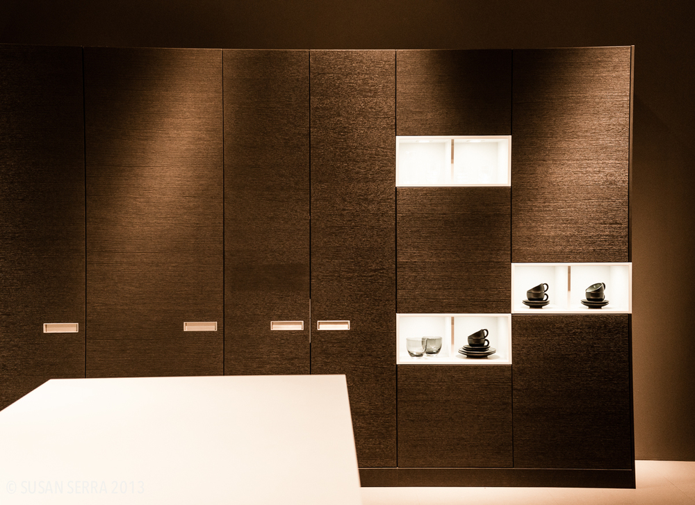
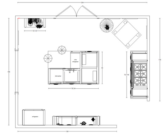
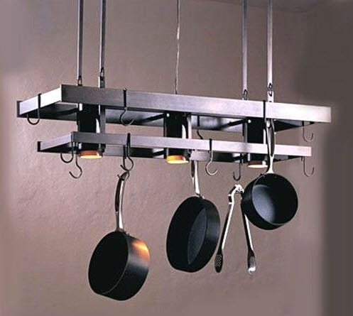
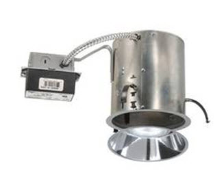
Recessed cans are often regarded today as being old and bulky, and ready for something new.  This might hold true if you currently have 6” or 8” recessed cans with standard white or black baffles trims.  Most manufacturers today make an assortment of trims and baffles that are easily interchangeable between fixtures, thus allowing over 40 possible appearances for any kitchen design.  Revitalizing a ceiling with either a trim change, or smaller more sophisticated recessed lighting is always a winner. 

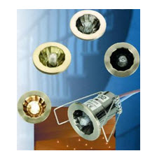
Synergy Lighting Starlites are the smallest recessed light fixtures available.  These small fixtures come in white or silver or custom color and add unique functionality.   Weather you choose to install them in rows or patterns, or simply place them randomly throughout the ceiling, the Starlites simulate a romantic, starlit sky when dimmed, and provide full task lighting when on full bright.

Contrast Lighting is another top pick for recessed lighting offering over 200 distinct options from simple to extravagant.  These dimmable fixtures provide ease of installation and affordability with the flexibility of adding the finishing touches to accentuate any design style.  Contrast offers from 2” modern to 5” contemporary and traditional styles and can be installed with ProLED light bulbs for the ultimate in energy savings.

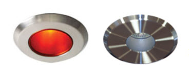
Contrast LightingFor kitchens with existing 5” or 6” recessed cans, Juno Lighting offers the ultimate in LED Solid State lighting with is fully dimmable LED remodel can that has 20 different trim options.  This fixture comes with a built in LED light engine that lasts for 60,000 hours of use.  For most kitchens, this means 30 years of never changing a light bulb.   At only 14 total watts, these LED fixtures provide crisp, brilliant illumination which is excellent for enhancing granite and simulated stone countertops, wood finishes and tile.

What are your recommendations for quantity of (general) light to specify for a kitchen? What part does beam spread play (I'm always concerned with that issue)? Do you have a quick and easy way to specify adequate lighting? 

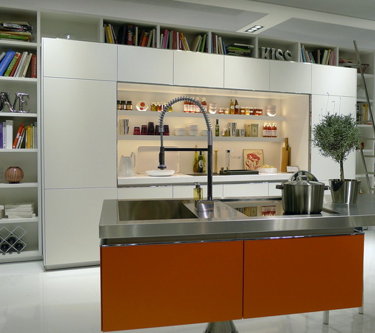
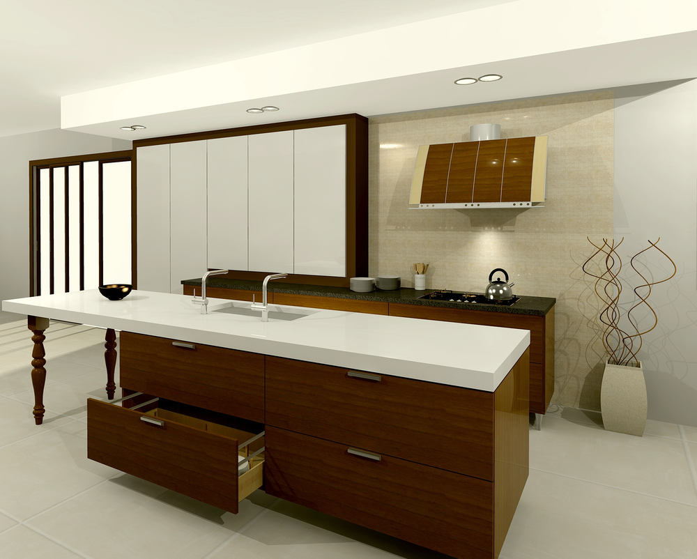
When designing lighting for any kitchen, you must consider layering three light levels for different occurrences that the kitchen will be used for.   These types of layers are referred to as event lighting.  Each event that will occur in the kitchen will require a separate form of adjustable (dimmable) lighting.  These are Task Lighting, Accent Lighting, and Mood Lighting and can be created by the following design tips.

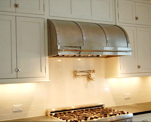
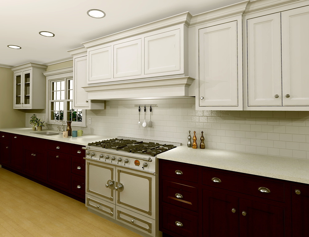
CablLED LightingTask Lighting:  Highest levels of light are required for activities such as Cooking, Cleaning, and Bill Paying, or homework.  Lighting should consist of adequate overhead lighting, and under cabinet lighting around counter tops and, islands and bars.

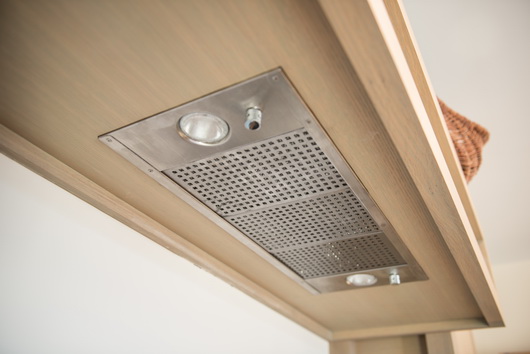
An excellent under cabinet lighting product is the CabLED from OptiLED.com, These IP68 Rate LED Strips are flexible and easy to install.  CabLEDTMcomes with a complete interconnection and mounting system for both indoor and outdoor under cabinet designs which enables it to be mounted on wallboard, concrete, brick, tile, metal, wood, glass or any surface which can support an anchor or adhesive base easily and without installation errors.  Available in both cool and warm LED, and completely waterproof against inadvertent splashing, the CabLED is an excellent, discrete under cabinet solution.

Accent Lighting: Moderate levels of light should be created in multiple layers such as Under and Over-cabinet lighting, or to position adjustable overhead lighting to illuminate architectural features such as range tops, open glass cabinets and décor. Typically, accent lighting is used in general home illumination when the kitchen is not in use.

Mood Lighting:  Lower levels of light are required, utilizing dimmers.  Popular forms of mood lighting are a combination of task and accent lighting, and optional lighting created from toe-kick lighting, or candle lights.  These help set a stage for parties, or romantic quiet evening with good food and fine wines.

What else should consumers and designers be aware of when thinking about kitchen lighting? 

By utilizing lighting in layers, homeowners can adjust these setting and create different landscapes throughout a kitchen to make the kitchen much more than the room where meals are prepared.  Remember a kitchen is the only room in the home that serves multiple uses, and can be illuminated for multiple dramatic effects.  Kitchen lighting is the most crucial lighting project for any home. 

When utilizing three types of lighting in a kitchen, the rule of thumb is 40 foot candles for cleaning and cooking, 20 foot candles for dining, and 2 foot candles for mood lighting.  

The bulk of foot candle illumination (task lighting) will come from the overhead lighting.  Remember that track lighting is a form of accent lighting, not task.  When determining the appropriate number of recessed cans or lighting fixtures for a ceiling, there is no such thing as too much when combined with dimmers, only too little.  A general rule of thumb is a minimum of 65 watts of incandescent or 11 watts of LED for every 20 square feet of kitchen space.  Beam spread is only a concern with extremely high ceilings in narrow kitchens that require longer distances of down light, all other main lighting should be of flood type lighting. 

Spot Lights and narrow beams are used in accent lighting at lower wattages only.  Under Cabinet lighting requires a minimum of 30 Watts Incandescent or 3 Watts LED per foot.   As for accent and mood lighting, these are added to task lighting, and require no other considerations past their existence in the kitchen.  Fluorescent lighting should always be avoided in a kitchen as the light source is dulling to countertops, wood grains and finishes.  

QUESTIONS FOR MATT? ASK IN THE COMMENTS SECTION!

Gimmeshelter Project - Join Us On The Journey!

I meant to formally introduce/announce this fantastic project before now, but at this moment, I want to enlist your help in making a decision on the interior of an inspiring house that I am working on. First, a bit about the project...

Leslie Hoffman, Executive Director of Earth Pledge is taking innovative green building and reuse philosophies to a new level with her current project, and personal residence, a modern beach house on bucolic Shelter Island, nestled between the twin forks of eastern Long Island. The project, named GimmeShelter, brings together a team of passionate green building professionals, led by Leslie's decades long commitment to sustainable living. The products used in this home represent the latest green technology, information on which Leslie is particularly eager to share in an effort to inform and educate. The GimmeShelter project introduces a new dimension of community to a single residential home, supporting new thinking in indoor/outdoor living. I will talk much more about this project in the coming weeks and months. I'm thrilled and honored to be a part of this project. It's pretty awesome.


 I went out to the site to meet Leslie (in a huge nor'easter-60mph winds, anyone?) to take a look at a ceiling issue that Leslie needs to make a decision on right away. Design is, and must be, a collaborative process. So, we put it up for discussion, in the spirit of community, one of Leslie's defining personal philosophies. The kitchen plays an important role in this issue.

The issue is this: The angled/pitched ceiling line can be built so that it follows through the entire space, from one side to the other, the entire space having a pitched ceiling, ending on the kitchen wall...or not. Each ending wall would have a triangular shape, formed by the pitch of the ceiling. You can see this natural roof pitch on one end of the space, on the wall directly opposite the big green square section of wall. 

One issue to consider is that there will be a wall of 8' tall doors, situated below the start of this higher wall (seen in green), extending to the exterior wall at the front of the house (toward the right of the image). The doors will be made of American walnut in a natural finish, harvested locally to the manufacturer. This "wall" of walnut is a strong visual element.

While the entire space is light filled with high ceilings, my concern lays with this wall of walnut being "heavy" on one end. Therefore, I would lean toward NOT continuing the natural slope of the ceiling all across the space. Given that there are walls of glass at the front and rear of the house, another theory might support a lower ceiling in order to "see" the interiors and their outdoor spaces in a more horizontal, rather than vertical, plane. The walnut "wall" of doors in the kitchen may, then, appear somewhat heavier.

Please tell us what you think about this issue. What would you do? Should the angled wall above Leslie in the last image be constructed to go all the way across the room to the other side? BE A FAN OF THE GIMME SHELTER GROUP ON FACEBOOK


Below: the wall directly opposite the square green wall on the other side of the room


Share |

Kitchen Blog Notes

Just a little blog housekeeping to do and to turn you on (do people still say that?) to a few things you may want to take a look at.

First, you'll see a new look for this blog. It's actually an update that I did myself. I may continue tweaking a bit here and there, but I needed a change, and to do a big change requires time that I just do not have right now to work with a professional graphic designer. So, much like organizing the kitchen, my new post on the really great blog, Hatch, here's a small update. I'm open to constructive suggestions too!

NOTE: There is a new share button at the end of every post. Please share! :) I'd love for you to share my posts wherever and with whomever you feel it is relevant for. Sharing is a good thing.


INTERIOR DESIGN CHAT - LIVE ON TWITTER - THURSDAY, FEBRUARY 25, 8-9pm

My great new interior designer friend, Wanda S. Horton, from North Carolina, came up with this very cool and fun idea to have a live chat, open to any questions at all on interior design (including kitchens) on Twitter. All you have to do is go here: #IDzinechat and you will see activity both from those who are asking questions and those who are answering. It's a good reason to start your own Twitter account, if you do not already have one. @tkpleslie (Leslie Carothers) on Twitter also lent her social media expertise to encourage this event to happen.

I'll be participating, so ask your kitchen questions, in 140 characters (I almost said calories-you know what's on my mind!) and I'll be on the lookout for them, and follow me on Twitter too: @susanserrackd

See you there!


A DREAM KITCHEN IN A VENTI CUP!

One day, in the middle of a million things, I suddenly had an urge to ask my Twitter friend, Franki Durbin, whose blog I've read and admired for a long time, to tell me about her dream kitchen. Franki has such a gift for spotting authentic style, so I knew she'd come up with some interesting kitchen dreams!

I love how granite countertops are in her kitchen dreams. You know, I've seen granite in kitchens for, well, 20+ years and yes, there is always the danger that a designer can tire of seeing the same fabulous design element over time. I challenge myself constantly NOT to fall into that trap, and I'm pleased that Franki is of the same mindset...smart gal!

I'd like you to go to Franki's post about her dream kitchen, because there are a number of other GREAT points and design ideas that she talks about, and I don't want to give them away here! Franki has a wonderful way with words...you'll be transported on a path of words right into the heart of that dream kitchen. Thank you for your post, Franki, and for your kind words. Your vision is truly inspirational!