

Jill was kind enough to lend her expertise in a kitchen chat (say that three times fast) about color. Jill Clarkson is an architectural color consultant and muralist located just minutes north of the Golden Gate bridge in beautiful Marin County. Jill Clarkson Color + Design service offerings include residential and commercial color consultations, custom designed and painted artwork, murals and wallpapers, home staging and redesign. Online color and design consultations are now available. On site consultations are available through out the San Francisco Bay area. See her blog www.jillclarksoncoloranddesign.blogspot.com or call 415 924 4204, for further information.
"Color in the Kitchen"
Kitchens today are becoming more and more colorful, most anything goes, which makes it a fun and exciting proposition to come up with a new color scheme. With so many surfaces to consider, such as the cabinets, the counter tops, the backsplash, the appliances and the walls, it may be a bit overwhelming but nonetheless the perfect place to express your creative vision. Warm colors can be used to create an inviting and convivial environment, fit for friends, feasts and conversation.
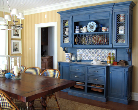
I'm sure you've noticed how when entertaining friends and family that there is a natural tendency for people to gather in the kitchen. It's the communal zone and the perfect place to add cheerful, friendly colors which will enhance the kitchen experience. For those that prefer a soothing and elegant space, a monochromatic scheme (see picture below.)
Using different intensities of the same color will provide interest without raising your pulse. For those a bit more daring, a complementary color scheme such as blue and orange or black and white will create a lively and pleasing space.
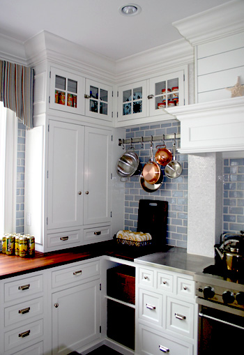
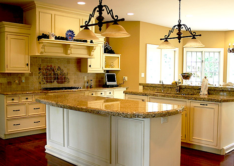
When working with wood cabinetry the color of the finish needs to be considered. For darker, warm cherry finishes, a contrasting cool color such as celadon green will look fresh and clean. For cool white cabinetry you may want to add warm colors such as yellow, almond or biscotti. I think white cabinetry also looks fabulous with sage green and blues.
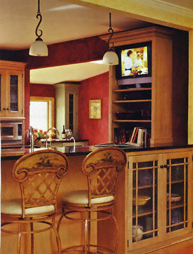
You can add warm colors with your textiles and accessories. For lighter wood cabinetry such as Maple or Pine you might want to consider going for a mid to darker shade that will really make the cabinetry pop. If you've invested a pretty penny on appliances, cabinetry or tile work then those things should take center stage. Use neutral paint colors that will allow the true stars of the kitchen shine.
A great rule of thumb is the 60/30/10 rule and stay away from using 50/50. Assign each color one of these percentages of kitchen real estate and be sure your colors work in harmony with your exisiting finishes and appliances. You'll be on your way to a great looking space! : )
Thanks Jill! I'm more conflicted than ever now, too many great combinations!